How to make interactive plots based on MPQr distances
gentry.RmdIntroduction
In this vignette, we will show how to use the MPQ distance family to
investigate patterns of beta diversity. To illustrate the tool, we will
analyze the dataset collected by Alwyn Gentry way back when. Our
analysis here is based on a version of the dataset that David Zeleny
posted on his anadat-r
repository. A phylogeny was built from the taxonomic information using
S.PhyloMaker,
and higher-order taxonomic information was inferred using taxonlookup.
We did a good deal of data cleaning, and all of the choices we made can
be seen in the script at data-raw/gentry.R in this
package.
Seting up and transformations
We start off by loading the packages we need for this analysis and
loading the gentry data, our version of which is available
as a phyloseq object. This object includes the counts of
each species observed at each of the sites, phylogenetic and taxonomic
information about the species, and information (latitude, longitude,
elevation, and precipitation) about each of the sites.
library(ape)
library(mpqDist)
library(plotly)
library(phyloseq)
library(tidyverse)
library(viridis)
library(plotly)
library(fields)
library(compositions)
data(gentry)
gentry
#> phyloseq-class experiment-level object
#> otu_table() OTU Table: [ 585 taxa and 197 samples ]
#> sample_data() Sample Data: [ 197 samples by 4 sample variables ]
#> tax_table() Taxonomy Table: [ 585 taxa by 4 taxonomic ranks ]
#> phy_tree() Phylogenetic Tree: [ 585 tips and 349 internal nodes ]Here we will apply a started log transform to the counts. We will show the same analysis below with the raw data or relative abundance data, but we believe the log transformation is generally beneficial. This is discussed in more detail in the paper, but there are two primary reasons for this. First, ratios tend to be more comparable than differences for abundance data. Second, the counts tend to have a very skewed distribution, which results in distances involving sites with very high abundances of a specific species to be very large.
The patterns tend to be the same with the log-transformed vs. raw data, but the values are more stable and the resulting patterns are easier to see with the log transformation.
Here we apply a started log transform to the abundances and we show the distributions of the raw and log-transformed abundances. The transformed abundances are still skewed, but to a lesser extent than the raw abundances. The plot below shows the distribution of non-zero abundances. The fraction of abundances that are 0 is about 99%.
mean(otu_table(gentry) == 0)
#> [1] 0.990325
gentry_log = gentry
otu_table(gentry_log) = otu_table(clr(1 + otu_table(gentry)), taxa_are_rows = FALSE)
abundance_df = data.frame(abundances = c(otu_table(gentry), otu_table(gentry_log)),
type = rep(c("raw", "transformed"), each = ntaxa(gentry) * nsamples(gentry)))
ggplot(subset(abundance_df, abundances > 0)) + geom_histogram(aes(x = abundances), bins = 100) +
facet_wrap(~ type, scales = "free_x")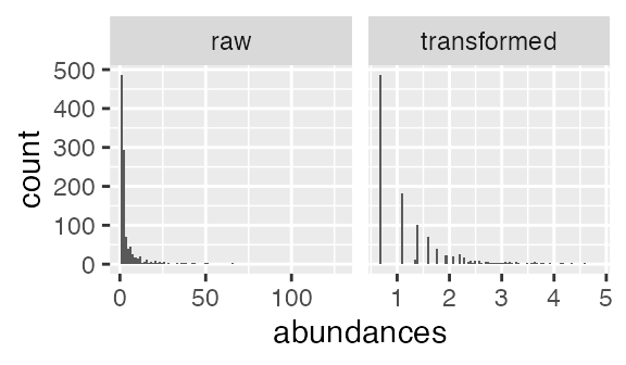
Distributions of raw and transformed abundances
Computing the distances
The get_mpq_distances function will compute the full
range of MPQr distances, with r taking values between 0 and 1. r = 0
corresponds to the standard Euclidean distance, small values of r can be
interpreted as measuring “terminal” phylogenetic dissimilarity, and
large values of r can be interpreted as measuring “basal” phylogenetic
dissimilarity. Its first argument should be a matrix (or something that
inherits from a matrix, like the otu_table object below).
Its second argument should be a phylogenetic tree of class
phylo. You can specify a set of values of r to compute if
you would like. If you don’t specify anything, the default is to take a
range of 101 values between 0 and 1 such that the are spaced more
closely near 0 and 1 and farther apart in the middle. There is not a
good theoretical reason for this, but it has worked well in all the
examples we have looked at.
distances = get_mpq_distances(otu_table(gentry_log), phy_tree(gentry_log))Built-in functions for interactive plots
It is easiest to visualize the family of distances with an animated plot. This package includes some helper functions that allow the user to make a couple of different kinds of plots and gives templates so as to allow the user to make custom versions if the ones included here are not suitable.
Plot distance to a reference set
The first kind of plot supported is one that shows the distance of
each individual sample to a set of “reference” samples. This sort of
plot would be of use if, for example, you had samples collected from
sites along a river and you wanted to visualize the distance between
each site and a reference site at one end of the river. The function
that computes this is called
plot_dist_to_reference_samples.
The required arguments are
-
physeq: A phyloseq object containing the species abundances at each site, a phylogenetic tree describing the species, and a sample data matrix with information about the sites. -
reference_samples: A vector containing either the names or the indices of the reference sites. -
x_variable: A string giving the name of the variable to plot on the x-axis.
As an example, the code below gives us a plot where each point corresponds to a site, its position on the y-axis corresponds to the average distance between that site and the sites near the equator, and its position on the x-axis corresponds to its latitude.
equatorial_samples = sample_names(gentry_log)[which(sample_data(gentry_log)$Lat >= -10 & sample_data(gentry_log)$Lat <= 10)]
plot_dist_to_reference_samples(physeq = gentry_log, reference_samples = equatorial_samples,
x_variable = "Lat")The function also allows for extra aesthetics to be passed to
ggplot when it is building the plot. For example, if you
want to have the points colored by Elevation, you would specify
color = "Elevation" in
plot_dist_to_reference_samples. The plot is built using
aes_string in ggplot, so any aesthetics that
geom_point understands can be specified in this way.
plot_dist_to_reference_samples(physeq = gentry_log, reference_samples = equatorial_samples,
x_variable = "Lat", color = "Elev", size = "Precip")Finally, if you want to be able to customize the plot more fully,
there is an option for the function to return a ggplot object which can
then be turned into an animated plot by calling the
ggplotly function on that object. The advantage of this way
of doing things is that the ggplot object can be modified before being
made into an animated plot, allowing for more customization. For
example, if we wanted to change the color scale, reverse the x axis, and
add a loess smoother, we could do it as follows:
p = plot_dist_to_reference_samples(physeq = gentry_log, reference_samples = equatorial_samples,
x_variable = "Lat", color = "Elev", return_ggplot = TRUE) +
stat_smooth(aes(frame = frame), se = FALSE) +
scale_x_reverse() +
scale_color_viridis()
ggplotly(p)
#> `geom_smooth()` using method = 'loess' and formula = 'y ~ x'Plot all pairs of distances
Another kind of plot that can be useful is one where the difference between each pair of sites is plotted. The standard here would be to have one point for each pair of samples, to plot the MPQr distance on the vertical axis and the geographical distance on the horizontal axis.
To make this sort of plot, you can use the function
plot_all_pairs. This function takes the following
arguments:
-
phy: A phyloseq object, the same asplot_dist_to_reference_samples. -
sample_distances: Either a matrix or an object of classdistcontaining the geographic distances between the samples.plot_all_pairsassumes that the samples in these objects are in the same order as the samples inphy. -
return_ggplot: Optional argument to return a ggplot object instead of plotting with ggplotly. By defaultreturn_ggplotisFALSE.
Since the number of pairs of distances grows with the square of the number of sites, it takes a long time to compute all pairs of distances in this dataset. I will therefore restrict just to the sites in Eastern North America. The code block below shows the locations of all the sites in the dataset and has the Eastern North American subset marked.
sample_data(gentry_log)$ena_subset = sample_data(gentry_log)$Lat > 25 & sample_data(gentry_log)$Long < 0 & sample_data(gentry_log)$Lat < 50
ggplot(sample_data(gentry_log)) +
borders("world", colour = "gray70", fill = "gray90") +
geom_point(aes(x = Long, y = Lat, shape = ena_subset, color = Elev)) + coord_fixed(1.3)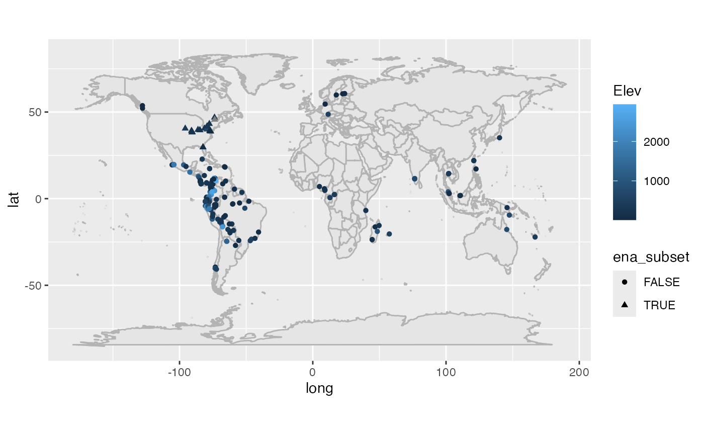
gentry_log_ena_subset = subset_samples(gentry_log, ena_subset)Next, we compute the distances between the sites (in this case, using
rdist.earth, which computes great circle distances), and
use those distances as input to plot_all_pairs. In this
case, plot_all_pairs was called with
return_ggplot = TRUE, which returns a ggplot object and
allows me to add a smoother. Finally, calling ggplotly(p)
creates the interactive plot.
greatcircle_sample_distances = rdist.earth(as.matrix(sample_data(gentry_log_ena_subset)[,c("Long", "Lat")]))
p = plot_all_pairs(gentry_log_ena_subset, greatcircle_sample_distances, return_ggplot = TRUE)
p = p + stat_smooth(aes(frame = frame), se = FALSE)
ggplotly(p)
#> `geom_smooth()` using method = 'loess' and formula = 'y ~ x'Helper functions for custom interactive plots
The package also includes helper functions that allow for more
customization, but since the interactive plots are based on ggplotly,
some knowledge of how ggplotly works is necessary to use these
functions. Briefly, to convert a standard ggplot2 plot to an animated
plot with ggplotly, you modify the plotting data frame so that it has an
extra column that specifies the “frame” of the animation, add that as
part of the aesthetic mapping (e.g. aes(frame = frame)) in
the ggplot, and then call the ggplotly function on the
resulting ggplot object. For more details, see the ggplotly documentation on
animations.
The make_animation_df function
The make_animation_df can help make this sort of data
frame. Its first argument is the output of
get_mpq_distances (a list with elements
distances and r), and its second argument is a
function that takes a single distance object and returns a data frame
with the variables needed to make one frame of the animation. Extra
arguments can be passed to the function that makes the data frame if
necessary. This function will be applied to each of the elements of the
distances slot of the output of
get_mpq_distances, the resulting data frames will be bound
together, and a column will be added indicating the frame of the
animation (one frame per value of r).
Once this data frame has been created, the user can make an animated
plot by adding frame = frame to the aesthetic specification
of the ggplot they would use for a static plot. Calling
ggplotly on the resulting ggplot object will make an
animated plot.
Function to create plotting variables
In the code block below, we show an example of creating the data
frame that we need to make an interactive plot. The
make_animation_df function in the last line of that block
takes as its first argument mpq_distances (the output from
the get_mpq_distances function). Its second argument is a
function, get_avg_distances_to_set. The
get_avg_distances_to_set function in turn has three
arguments, which are given as the final three arguments to
make_animation_df and which that function passes along to
get_avg_distances_to_set. So in this case, inside the
make_animation_df function, there is a call to
get_avg_distances_to_set(nmv, equatorial_samples, sample_data(gentry_log)).
equatorial_samples = sample_names(gentry_log)[which(sample_data(gentry_log)$Lat >= -10 & sample_data(gentry_log)$Lat <= 10)]
nmv = get_null_mean_and_variance(gentry_log)
mpq_distances = get_mpq_distances(otu_table(gentry_log), phy_tree(gentry_log))
animation_df = make_animation_df(mpq_distances, get_avg_distances_to_set, means_and_vars = nmv, equatorial_samples, sample_data(gentry_log))Finally, once we have the animation_df data frame, we
can make an animated plot. We start off making p, a ggplot
object, that specifies the sort of plot we want for each value of
r. In each aes specification, we add
frame = frame, which will make the plot scroll through the
different values of r. Finally we call
ggplotly on p to make the interactive
plot.
p = ggplot(aes(x = Lat, y = avg_dist, color = Elev), data = animation_df) +
geom_point(aes(frame = frame)) +
geom_hline(aes(yintercept = null_mean, frame = frame)) +
geom_hline(aes(yintercept = null_mean - 2 * null_sd, frame = frame)) +
geom_hline(aes(yintercept = null_mean + 2 * null_sd, frame = frame)) +
stat_smooth(aes(frame = frame), se = FALSE, method = "gam") +
scale_x_reverse() +
scale_color_viridis()
ggplotly(p)
#> `geom_smooth()` using formula = 'y ~ s(x, bs = "cs")'Code to create plots in manuscript
The following code makes a plot that is in the manuscript, comparing MPQr distances to each other, to Bray-Curtis, and to distances computed on agglomerated species counts.
mpq_distances = get_mpq_distances(otu_table(gentry_log), phy_tree(gentry_log))
## compute Bray-Curtis dissimilarity on untransformed data
mpq_distances$distances[["bray"]] = distance(gentry, method = "bray")
mpq_distances$r = c(mpq_distances$r, "bray")
## agglomerate the untransformed data to order level, then clr-transform the agglomerated data
gentry_order_glom = tax_glom(gentry, taxrank = "order")
gentry_log_order_glom = gentry_order_glom
otu_table(gentry_log_order_glom) = otu_table(clr(otu_table(gentry_order_glom) + 1), taxa_are_rows = FALSE)
## agglomerate the untransformed data to order level, then clr-transform the agglomerated data
gentry_group_glom = tax_glom(gentry, taxrank = "group")
gentry_log_group_glom = gentry_group_glom
otu_table(gentry_log_group_glom) = otu_table(clr(otu_table(gentry_group_glom) + 1), taxa_are_rows = FALSE)
## compute Euclidean distances on the clr-transformed agglomerated data
mpq_distances$distances[["order_glom"]] = dist(otu_table(gentry_log_order_glom))
mpq_distances$r = c(mpq_distances$r, "order_glom")
mpq_distances$distances[["group_glom"]] = dist(otu_table(gentry_log_group_glom))
mpq_distances$r = c(mpq_distances$r, "group_glom")
## we will compare to the northern temperate samples
temperate_samples = sample_names(gentry_log)[which(sample_data(gentry_log)$Lat >= 23.5 & sample_data(gentry_log)$Lat <= 66.5)]
## this is a roundabout way of doing things, but make_animation_df
## here sets up the data for plotting for the MPQr distances + Bray
## Curtis + Euclidean distance on agglomerated data. I will use a subset of it to plot later
animation_df = make_animation_df(mpq_distances, get_avg_distances_to_set, means_and_vars = NULL, temperate_samples, sample_data(gentry_log))
## I will be plotting mpqr distances with r = 0, 1, .7 + bray-curtis + Euclidean distance on two levels of agglomeration
mid_r = "0.712889645782536"
animation_df_sub = subset(animation_df, frame %in% c(mid_r, "0", "1", "bray", "order_glom", "group_glom"))
## this data frame will allow me to plot averages in 15-degree-of-latitude bins
animation_df_summarised = animation_df_sub |>
mutate(latitude_bin = round(Lat / 15) * 15) |>
group_by(frame, latitude_bin) |> summarise(mean_in_bin = mean(avg_dist), se_in_bin = sd(avg_dist) / sqrt(length(avg_dist)))
#> `summarise()` has grouped output by 'frame'. You can override using the
#> `.groups` argument.
## making frame into an ordered factor so that the facots are plotted in the order I want
animation_df_sub$frame = factor(animation_df_sub$frame,
levels = c("0", mid_r, "1", "bray", "order_glom", "group_glom"),
ordered = TRUE)
animation_df_summarised$frame = factor(animation_df_summarised$frame,
levels = c("0", mid_r, "1", "bray", "order_glom", "group_glom"),
ordered = TRUE)
## to do custom facet labels
frame_labels <- c("0" = "r = 0",
mid_r = paste("r = ", round(as.numeric(mid_r), digits = 2), sep = ""),
"1" = "r = 1",
"bray" = "Bray-Curtis",
"order_glom" = "Glommed to order",
"group_glom" = "Glommed to phylum")
names(frame_labels)[2] = mid_r
#pdf("gentry-latitudinal-distance.pdf", width = 7, height = 5)
ggplot(data = animation_df_sub) +
geom_point(aes(x = Lat, y = avg_dist), size = .8, color = 'gray', pch = 1) +
geom_errorbar(aes(x = latitude_bin,
ymin = mean_in_bin - 2 * se_in_bin,
ymax = mean_in_bin + 2 * se_in_bin),
data = animation_df_summarised,
width = 6) +
annotate("rect",
xmin = 23.5, xmax = 66.5, # x-range to shade
ymin = -Inf, ymax = Inf, # full y-range
alpha = 0.2, fill = "blue") +
geom_point(aes(x = latitude_bin, y= mean_in_bin),
data = animation_df_summarised) +
geom_line(aes(x = latitude_bin, y= mean_in_bin),
data = animation_df_summarised) +
scale_x_reverse(breaks = seq(60, -40, by = -20)) +
xlab("Latitude") + ylab("Average distance to northern temperate sites")+
facet_wrap( ~ frame, scales = "free_y", ncol = 3,
labeller = labeller(.default = frame_labels))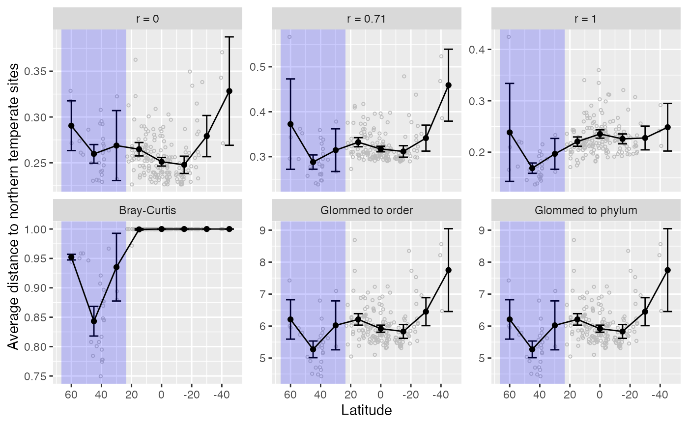
#dev.off()