Let’s start off with a scatterplot:
ggplot(census) + geom_point(aes(x = Year, y = Population))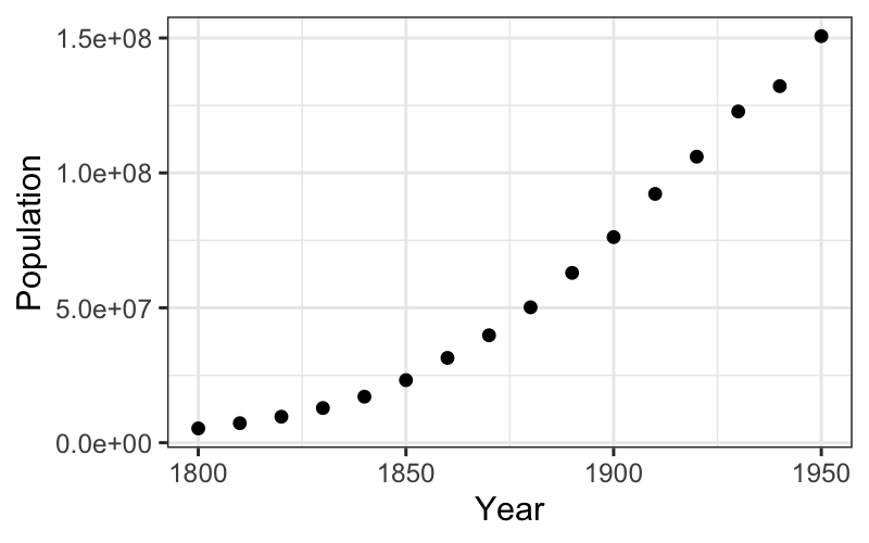
What do we learn about the census numbers from the scatterplot?
Julia Fukuyama
Optional reading: Tukey, Exploratory Data Analysis, Chapter 5, introduction and sections D-H, and Chapter 6 (posted on the website).
Read Chapter 5 more for the philosophy than for the implementation details.
In particular, Tukey fits lines by eye (sections A-C in Chapter 5), which we will never do.
Reading 2: Wikle, Data Visualization Chapter 29, “Telling a story and making a point”
Recall the EDA philosophy: We want to notice as many things as possible about the data, collect all appearances.
For univariate data, collecting all the appearances meant looking at the distributions of the numbers: their center, spread, skewness, outliers, whether they seem to come from standard distributions.
For bivariate data, we will want to know about the relationship between the variables. Because this is EDA, we want to explain the relationship between the variables, and we want the explanation to be as simple as possible (but no simpler).
The simplest explanation for the relationship between two variables is linear, so today we will look at
A first example: US Census data, 1800-1950
The dataset provided has census data from 1790 to 2010. We want to reproduce Tukey’s analysis, so we will just use 1800-1950.
## Rows: 23 Columns: 2
## ── Column specification ──────────────────────────────────────────────────────────────────────────────────────
## Delimiter: ","
## dbl (2): Year, Population
##
## ℹ Use `spec()` to retrieve the full column specification for this data.
## ℹ Specify the column types or set `show_col_types = FALSE` to quiet this message.Let’s start off with a scatterplot:

What do we learn about the census numbers from the scatterplot?
We can check on the multiplicative hypothesis by plotting on a log scale:
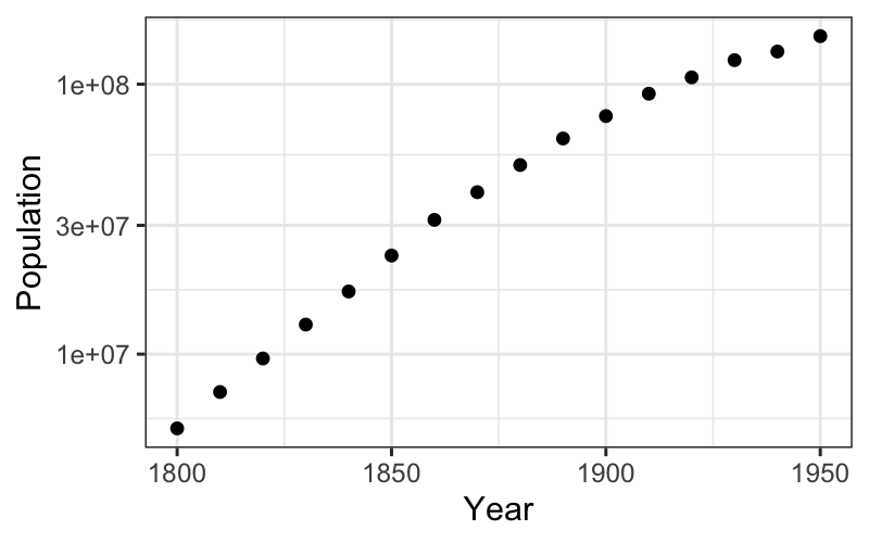
The trend in the first half does look quite linear on the log scale.
The scatterplot gives us a rough idea or a first hypothesis about the form the data come in.
We’re not done though: We want to check how well the linear hypotheses fit, and we want to “go one level deeper” and examine the deviations from the line.
To do this, we need to find a best fitting line and examine the deviations from that line.
You remember from your linear models class the statistical interpretation of least squares: it is a maximum likelihood estimate in the model \(y_i = \beta_0 + x_i\beta + \varepsilon_i\), \(\varepsilon_i \sim \mathcal N(0, \sigma^2)\).
“Least squares” reminds us that there is another interpretation of the same line: it minimizes the sum of squared residuals.
Let’s check on the appearance of linearity in the latter half of the
data. To do this, we first get the least squares fit on the second half
of the data using lm in R.
To fit on just half the points, we can use sample weights in the
lm function. Below, these weights are created with
mutate. Note that as.numeric on a boolean
vector changes FALSE to 0 and TRUE to 1.
## [1] 1875Side note: if you’ve ever tried to programmatically get information
out of the lm object, you’ll remember what a pain it is. The
broom package (“broom: Let’s tidy up a bit”) has three
functions that give you coefficients, fits and residuals, and model fit
information as tibbles. No more summary(fit)$r.squared
calls!
## # A tibble: 2 × 5
##   term            estimate std.error statistic       p.value
##   <chr>              <dbl>     <dbl>     <dbl>         <dbl>
## 1 (Intercept) -2643679502. 51422012.     -51.4 0.00000000363
## 2 Year 1432289. 26850. 53.3 0.00000000291## # A tibble: 16 × 9
## Population Year `(weights)` .fitted .resid .hat .sigma .cooksd .std.…¹
## <dbl> <dbl> <dbl> <dbl> <dbl> <dbl> <dbl> <dbl> <dbl>
## 1 5308483 1800 0 -65558757. 7.09e7 0 0 0 NA
## 2 7239881 1810 0 -51235864. 5.85e7 0 0 0 NA
## 3 9638453 1820 0 -36912971. 4.66e7 0 0 0 NA
## 4 12866020 1830 0 -22590078. 3.55e7 0 0 0 NA
## 5 17069453 1840 0 -8267185. 2.53e7 0 0 0 NA
## 6 23191876 1850 0 6055708. 1.71e7 0 0 0 NA
## 7 31443321 1860 0 20378601. 1.11e7 0 0 0 NA
## 8 39818449 1870 0 34701494. 5.12e6 0 0 0 NA
## 9 50189209 1880 1 49024387. 1.16e6 0.417 1.78e6 0.274 0.876
## 10 62947714 1890 1 63347280. -4.00e5 0.274 1.89e6 0.0137 -0.269
## 11 76212168 1900 1 77670173. -1.46e6 0.179 1.77e6 0.0929 -0.924
## 12 92228496 1910 1 91993066. 2.35e5 0.131 1.90e6 0.00159 0.145
## 13 106021537 1920 1 106315959. -2.94e5 0.131 1.90e6 0.00248 -0.181
## 14 122775046 1930 1 120638852. 2.14e6 0.179 1.59e6 0.199 1.35
## 15 132164569 1940 1 134961745. -2.80e6 0.274 1.22e6 0.671 -1.89
## 16 150697361 1950 1 149284638. 1.41e6 0.417 1.72e6 0.404 1.06
## # … with abbreviated variable name ¹.std.resid## # A tibble: 1 × 12
## r.squared adj.r.squa…¹ sigma stati…² p.value df logLik AIC BIC devia…³
## <dbl> <dbl> <dbl> <dbl> <dbl> <dbl> <dbl> <dbl> <dbl> <dbl>
## 1 0.998 0.998 1.74e6 2846. 2.91e-9 1 -125. 256. 257. 1.82e13
## # … with 2 more variables: df.residual <int>, nobs <int>, and abbreviated
## # variable names ¹adj.r.squared, ²statistic, ³devianceBack to plots: we want to plot two layers, one with the linear smoother and one with the best fitting line.
ggplot(census) + geom_point(aes(x = Year, y = Population)) +
    geom_abline(aes(intercept = estimate[1], slope = estimate[2]), data = tidy(fit_late))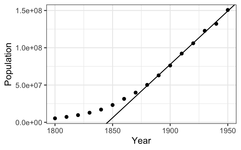
We see that the line does a good job of explaining the later population numbers, although it is not perfect. We want to look at these more closely.
We can see the residuals as the deviations from the best fitting line on the plot, but they are much clearer when the line is subtracted out and the residuals are plotted by year.
The augment function adds fits, residuals, and several
other measures to the data we fed in to lm. We can use it
to plot residuals:
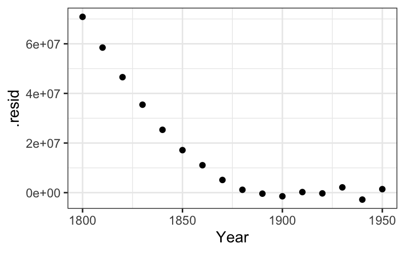
ggplot(augment(fit_late)) + geom_point(aes(x = Year, y = .resid)) +
    scale_y_continuous(limits = c(-5 * 10^6, 5 * 10^6)) +
    scale_x_continuous(limits = c(midpoint, max(census$Year)))
## Warning: Removed 8 rows containing missing values (`geom_point()`).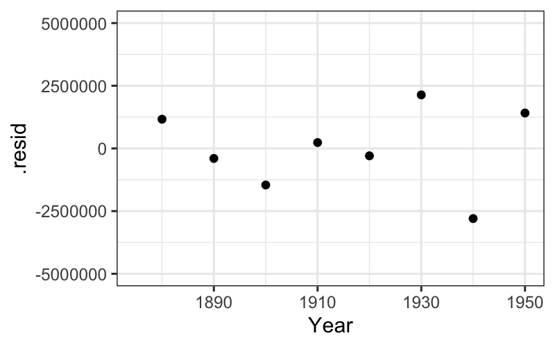
Let’s also check up on the linearity on the log scale of the early population numbers. We can proceed the same way as with the late numbers:
## I'll make the weight variable without the pipe this time
census = mutate(census, early = as.numeric(Year <= midpoint), log_population = log10(Population))
fit_early = lm(log_population ~ Year, data = census, weights = early)
tidy(fit_early)
## # A tibble: 2 × 5
## term estimate std.error statistic p.value
## <chr> <dbl> <dbl> <dbl> <dbl>
## 1 (Intercept) -15.9 0.216 -73.9 4.13e-10
## 2 Year 0.0126 0.000118 107. 4.45e-11## # A tibble: 1 × 12
## r.squared adj.r.sq…¹ sigma stati…² p.value df logLik AIC BIC devia…³
## <dbl> <dbl> <dbl> <dbl> <dbl> <dbl> <dbl> <dbl> <dbl> <dbl>
## 1 0.999 0.999 0.00762 11482. 4.45e-11 1 28.8 -51.6 -51.4 3.48e-4
## # … with 2 more variables: df.residual <int>, nobs <int>, and abbreviated
## # variable names ¹adj.r.squared, ²statistic, ³devianceThen we can look at the fitted line and the residuals after we’ve subtracted out the fitted line:
ggplot(census) + geom_point(aes(x = Year, y = log10(Population))) +
    geom_abline(aes(intercept = estimate[1], slope = estimate[2]), data = tidy(fit_early))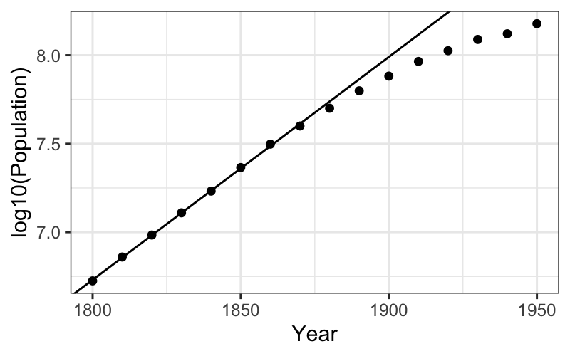
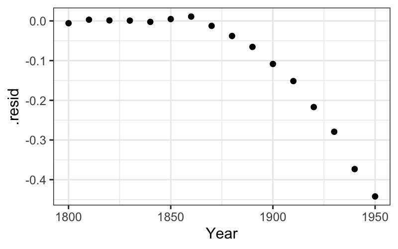
ggplot(augment(fit_early)) +
    geom_point(aes(x = Year, y = .resid)) +
    scale_x_continuous(limits = c(min(census$Year), midpoint)) +
    scale_y_continuous(limits = c(-.025, .025))
## Warning: Removed 8 rows containing missing values (`geom_point()`).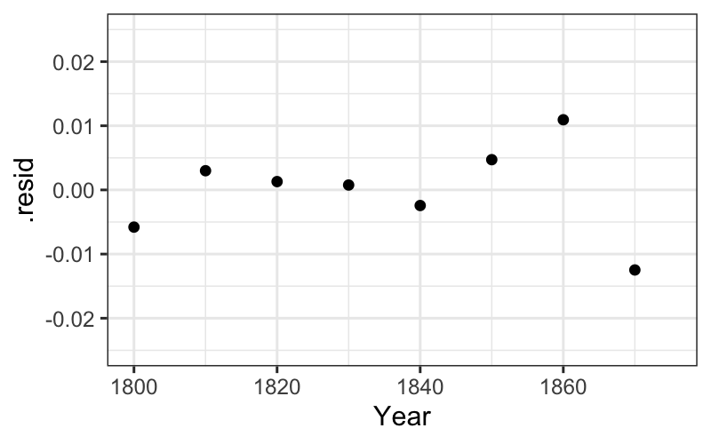
Reading: Tukey, Chapter 6
For the population data, our prior knowledge about population growth suggested a log transformation.
What if we don’t know anything in particular about the problem? How do we know what transformations to use?
Defining curvature:
If the relationship between our variables is hollow upward or hollow downward, there is some general advice about power transformations to use to straighten out the relationship.
Recall Box-Cox transformations: \(f_\tau(y) = \frac{y^\tau - 1}{\tau}\) for \(\tau \ne 0\), \(f_\tau(y) = \log(y)\) for \(\tau = 0\).
We can think of these as a ladder of transformations: for example, for \(\tau = 3, 2, 1, 1/2, 0, -1/2, -1, -2, -3\), we have:
\[\begin{matrix} \frac{y^3 - 1}{3}\\ \frac{y^2 - 1}{2}\\ y\\ \frac{\sqrt y - 1}{1/2}\\ \log y\\ - \frac{y^{-1/2} - 1}{1/2}\\ -y^{-1} - 1\\ -\frac{y^{-2} - 1}{2} \\ -\frac{y^3 - 1}{3}\end{matrix}\]
Note: I have expressed these as the Box-Cox transformations, but you can also use power transformations with the same “ladder” structure.
If we are looking at the relationship between \(y\) and \(x\), the set of Box-Cox transformations has the following nice property:
If the relationship between one transformation of \(y\) and \(x\) is straight, the relationship of the transformations below with \(x\) are hollow downward, and the relationship of the transformations above with \(x\) are hollow upward.
Therefore, the following advice:
We saw this with the population data: the raw early numbers (\(\tau = 1\)) are hollow up, and a transformation down the ladder (\(\log (y)\), \(\tau = 0\)) straightened out the relationship.
Compare:
ggplot(subset(census, Year <= midpoint), aes(x = Year, y = Population)) +
    geom_point() +
    stat_smooth(method = "lm", se = FALSE)
## `geom_smooth()` using formula = 'y ~ x'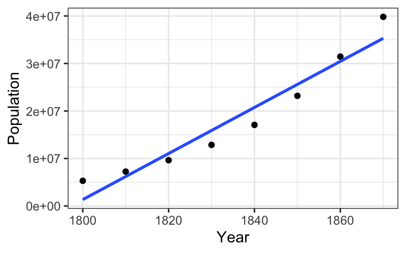
ggplot(subset(census, Year <= midpoint), aes(x = Year, y = log10(Population))) +
    geom_point() +
    stat_smooth(method = "lm", se = FALSE)
## `geom_smooth()` using formula = 'y ~ x'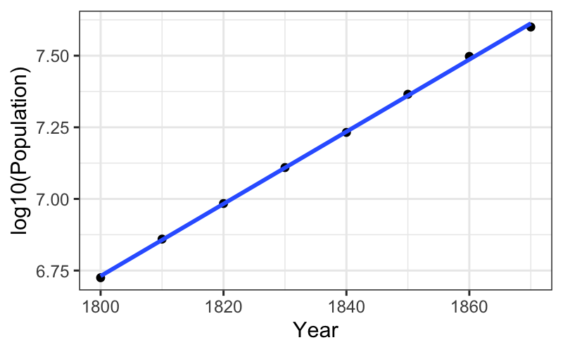
What if we want to transform \(x\) instead of \(y\)?
Notice that a straight relation of \(y\) vs. \(x\) is exactly the same as a straight relation of \(x\) vs. \(y\). So if we want to straighten a curved relation by transforming \(x\), just plot \(x\) on the vertical axis, \(y\) on the horizontal axis, and follow the same procedure we used to transform \(y\).
Let’s see how this works on the census data again.
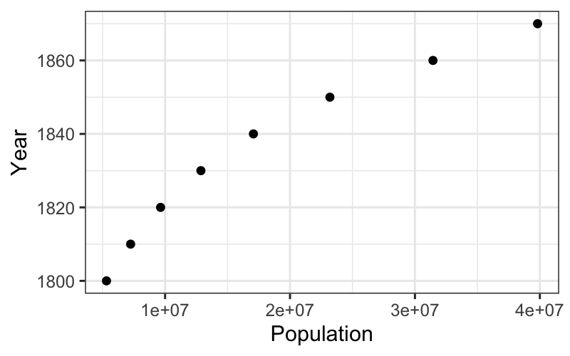
Is this hollow up or hollow down? Which way should we go on the ladder of transformations?
Year is actually not a good candidate for transformation because the values differ only by a couple of percentage points from each other.
To mitigate this, we transform a linear function of year, looking at centuries since 1600 instead of the raw value of year.
census = census %>% mutate(CentSince1600 = (Year - 1600) / 100)
box_cox = function(y, tau) {
    return((y^tau - 1) / tau)
}
ggplot(subset(census, Year <= midpoint), aes(x = Population, y = CentSince1600)) +
    geom_point() +
    stat_smooth(method = "lm", se = FALSE)
## `geom_smooth()` using formula = 'y ~ x'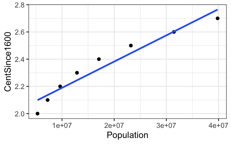
ggplot(subset(census, Year <= midpoint), aes(x = Population, y = box_cox(CentSince1600, 3))) +
    geom_point() +
    stat_smooth(method = "lm", se = FALSE)
## `geom_smooth()` using formula = 'y ~ x'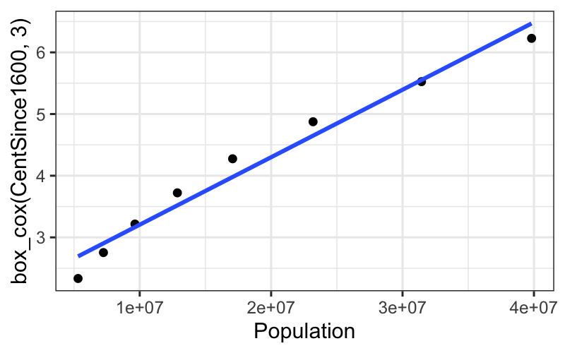
## $y
## [1] "Transformed Year, Power = 3"
##
## attr(,"class")
## [1] "labels"ggplot(subset(census, Year <= midpoint), aes(x = Population, y = box_cox(CentSince1600, 5))) +
geom_point() +
stat_smooth(method = "lm", se = FALSE) +
ylab("Transformed Year, Power = 5")## `geom_smooth()` using formula = 'y ~ x'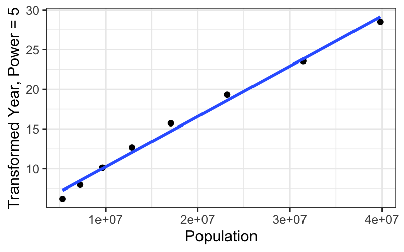
ggplot(subset(census, Year <= midpoint), aes(x = Population, y = box_cox(CentSince1600, 7))) +
    geom_point() +
    stat_smooth(method = "lm", se = FALSE) +
    ylab("Transformed Year, Power = 7")
## `geom_smooth()` using formula = 'y ~ x'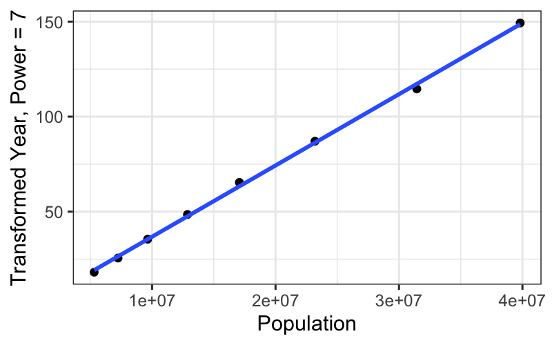
ggplot(subset(census, Year <= midpoint), aes(x = Population, y = box_cox(CentSince1600, 9))) +
    geom_point() +
    stat_smooth(method = "lm", se = FALSE) +
    ylab("Transformed Year, Power = 9")
## `geom_smooth()` using formula = 'y ~ x'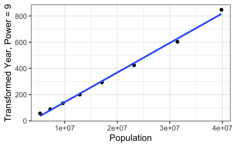
We get a really straight relationship with the re-expressed x, but the interpretation isn’t as nice as the log transformation.
For communicating our findings to other people, and for understanding them ourselves, it’s important to have balance the simple, linear explanation that you can get with transformed data against the interpretability of the transformation itself.
Data = fit + residual
Note that this is a more data analytic than statistical look at the numbers.
If we were thinking like statisticians, we might draw Q-normal plots of the residuals.
Would present: Broad-scale trends, then deviations from those trends
Early population growth is exponential, or linear on a log scale:
ggplot(census) + geom_point(aes(x = Year, y = log10(Population))) +
    geom_abline(aes(intercept = estimate[1], slope = estimate[2]), data = tidy(fit_early)) +
    ggtitle("Log-population of the US\nwith a line of best fit for years before 1875")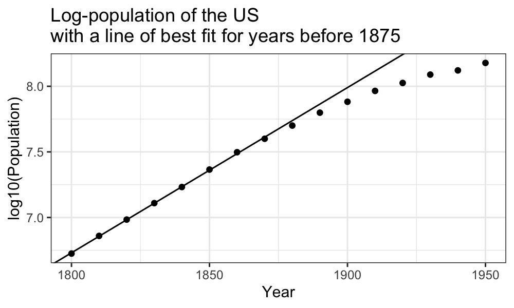
Late population growth is approximately linear:
ggplot(census) + geom_point(aes(x = Year, y = Population)) +
    geom_abline(aes(intercept = estimate[1], slope = estimate[2]), data = tidy(fit_late)) +
    ggtitle("Population of the US\nwith a line of best fit for the years after 1875")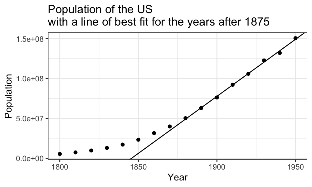
There are some major deviations from what we would expect in both the early and the late regimes:
ggplot(augment(fit_early)) +
    geom_point(aes(x = Year, y = .resid)) +
    scale_x_continuous(limits = c(min(census$Year), midpoint)) +
    scale_y_continuous(limits = c(-.025, .025)) +
    ggtitle("Deviations of early census numbers\nfrom exponential trend")
## Warning: Removed 8 rows containing missing values (`geom_point()`).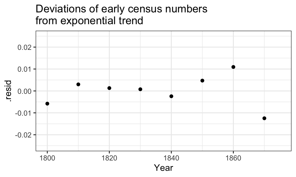
ggplot(augment(fit_late)) + geom_point(aes(x = Year, y = .resid)) +
    scale_y_continuous(limits = c(-5 * 10^6, 5 * 10^6)) +
    scale_x_continuous(limits = c(midpoint, max(census$Year))) +
    ggtitle("Deviations of late census numbers\nfrom linear trend")
## Warning: Removed 8 rows containing missing values (`geom_point()`).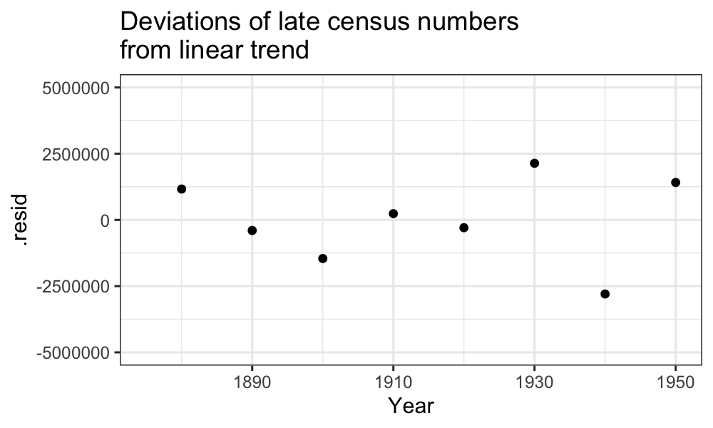
Smoothers and robust fits, for when even transformations don’t save us.