Stat 470/670 Lecture 18: Categorical data and
contingency tables
Julia Fukuyama
Goal today: Visualizing categorical data
- We will mainly use the vcd package.
- Many tools don’t work well (e.g. scatterplots don’t make much sense
when we have all categorical data)
- Mosaic plot will be the equivalent of a scatterplot
- Cotab plot will be the equivalent of a coplot
- Doubledecker plot for displaying conditional probabilities
Motivating example: UCB Admissions Data
The admissions data is formatted as a three-way contingency
table.
In a contingency table, each dimension of the table (rows and columns
for two-way tables) gives the levels of one variable.
For the admissions data, we have
Admit: Whether the applicant was admitted, either
Admitted or Rejected,
Gender: The gender of the applicant, either
Male or Female,
Dept: The academic department the applicant wanted
admission into, labeled A through F.
The cells in the table represent the number of observations with each
combination of values: the [1,1,1] element of
UCBAdmissions is the number of admitted men to Department
A, the [2,1,1] element is the number of rejected men to
Department A, and so on.
## Loading required package: grid
data(UCBAdmissions)
UCBAdmissions
## , , Dept = A
##
##           Gender
## Admit      Male Female
##   Admitted  512     89
##   Rejected  313     19
##
## , , Dept = B
##
##           Gender
## Admit      Male Female
##   Admitted  353     17
##   Rejected  207      8
##
## , , Dept = C
##
##           Gender
## Admit      Male Female
##   Admitted  120    202
##   Rejected  205    391
##
## , , Dept = D
##
##           Gender
## Admit      Male Female
##   Admitted  138    131
##   Rejected  279    244
##
## , , Dept = E
##
##           Gender
## Admit      Male Female
##   Admitted   53     94
##   Rejected  138    299
##
## , , Dept = F
##
##           Gender
## Admit      Male Female
##   Admitted   22     24
##   Rejected  351    317
## the structable command in vcd lets us re-arrange contingency tables
structable(Admit ~ Gender, data = UCBAdmissions)
##        Admit Admitted Rejected
## Gender
## Male             1198     1493
## Female            557     1278
What questions do we have here?
For the admissions data (and generally for contingency tables), the
first thing we want to know is whether the numbers are consistent with
independence between the variables we measured.
In particular, for the admissions data, we want to know whether
admission is independent of gender: if it’s not, we might suspect that
there is some sort of gender-based discrimination happening in the
admissions process, and we would want to complain to someone.
If the variables aren’t independent of each other, we want to know
what the cause is.
Chi-squared test of independence
If all we care about is testing, we could just use a chi-squared test
of independence and be done.
chisq.test(structable(Admit ~ Gender, data = UCBAdmissions), correct = FALSE)
##
##  Pearson's Chi-squared test
##
## data:  structable(Admit ~ Gender, data = UCBAdmissions)
## X-squared = 92.205, df = 1, p-value < 2.2e-16
If we do that test, we see that the two factors are not independent,
but there are still some questions we might have:
- What is the nature of the non-independence?
- What cells in the contingency table are over- or under-represented
compared to what we would expect under independence of the two
factors?
Mosaic plot
A mosaic plot gives a visualization of a two-way contingency
table.
- Each cell in the contingency table is represented by a tile.
- The area of the tile is proportional to the number of observations
in the corresponding cell of the contingency table.
- The height of a row is proportional to the marginal probability of
the category described by that row.
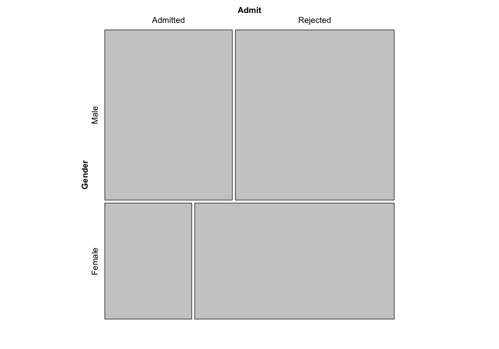
Let’s take a look at the admissions data with a mosaic plot.
Here we’re looking at admission and gender. The area of each tile
shows us how many applicants were in each of the four categories: either
admitted/male, admitted/female, rejected/male, or rejected/female.
The heights of the tiles represent the overall fraction of applicants
that were male or female. (If we call the function the other way,
mosaic(~ Admit + Gender), the heights of the tiles would
represent the overall fraction of applicants that were admitted or
rejected, you can try it out and see.)
mosaic(~ Gender + Admit, data = UCBAdmissions)

The really nice thing about mosaic plots is that they tell us about
departures from independence.
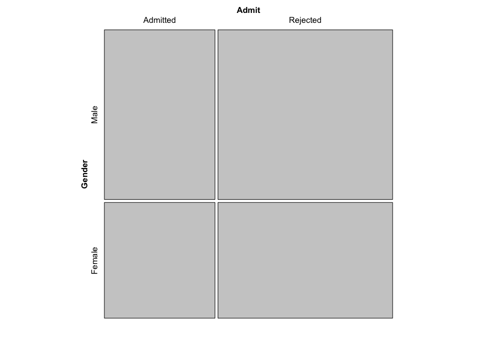
It turns out (you can try to figure the math out yourself if you’re
interested) that if the factors were really independent of each other,
the boundaries of the tiles would match up, and we would have something
that looks like this:
mosaic(independence_table(structable(Admit ~ Gender, data = UCBAdmissions)))

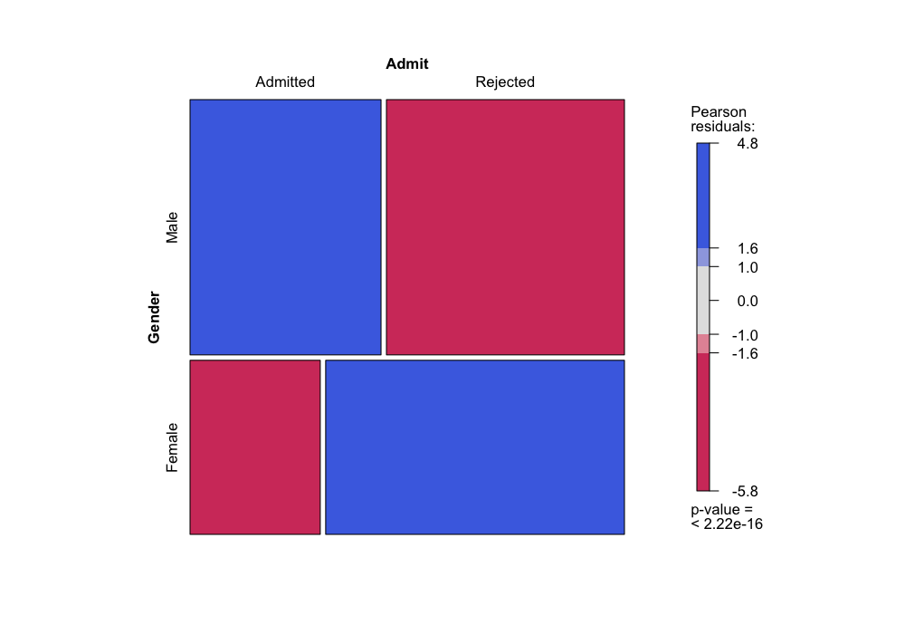
To the extent that the boundaries of the tiles don’t match, we can
see which categories are over-represented or under-represented.
The R function allows us to color the tiles as an additional way to
show departures from independence: in the coloring scheme below, blue
tiles represent cells that have more observations than we would expect
if the factors were independent, and red tiles represent cells that have
fewer observations than we would expect if the factors were
independent.
mosaic(~ Gender + Admit, data = UCBAdmissions, gp = shading_max)

The colors represent residuals from the independence model: how many
more observations do we have than we would expect if the factors were
actually independent of each other?
There are a number of different options for coloring, but they are
all based on deviations from expected values under the independence
model.
We can check this:
(E = independence_table(structable(Admit ~ Gender, data = UCBAdmissions)))
##         Admit
## Gender    Admitted Rejected
##   Male   1043.4611 1647.539
##   Female  711.5389 1123.461
(O = structable(Admit ~ Gender, data = UCBAdmissions))
##        Admit Admitted Rejected
## Gender
## Male             1198     1493
## Female            557     1278
## Recall that this is the Chi-squared test statistic
sum((O - E)^2 / E)
## [1] 92.20528
## These are the "Pearson residuals"
sqrt((O - E)^2 / E) * sign(O - E)
##        Admit  Admitted  Rejected
## Gender
## Male          4.784093 -3.807325
## Female       -5.793466  4.610614
Conditional independence
We’ve seen that there’s a lack of independence between gender and
admission, so we would like to investigate more to see if we can explain
the non-independence.
We have one other variable in our contingency table: Department.
We can look at how the departments differ in their admissions rates
and in the gender composition of their applicant pools:
structable(Dept ~ Admit, data = UCBAdmissions)
##          Dept   A   B   C   D   E   F
## Admit
## Admitted      601 370 322 269 147  46
## Rejected      332 215 596 523 437 668
structable(Dept ~ Gender, data = UCBAdmissions)
##        Dept   A   B   C   D   E   F
## Gender
## Male        825 560 325 417 191 373
## Female      108  25 593 375 393 341
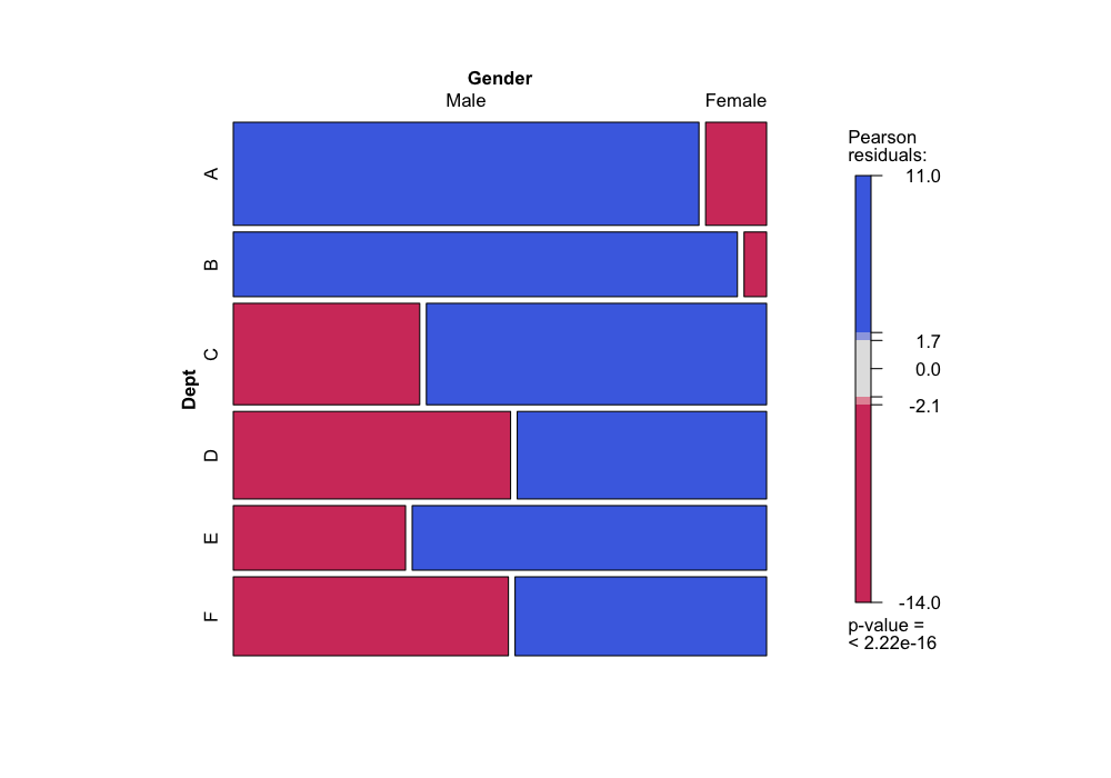
Or, more to the point of this course, we can look at the same
information graphically:
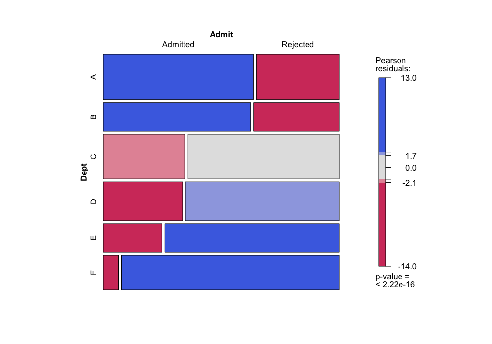
mosaic(~ Dept + Gender, data = UCBAdmissions, gp = shading_max)

mosaic(~ Dept + Admit, data = UCBAdmissions, gp = shading_max)

Note that here, when we plot with Dept on the vertical
axis, it is easy to compare the conditional probabilities of gender
given department (from the first plot) or admission given department
(from the second plot) by comparing the widths of the bars. If we had
plotted the other way (mosaic(~ Dept + Gender)), we would
have to compare areas instead of widths, which is much more difficult
perceptually.
Since the different departments both admit students at very different
rates and have very different proportions of male and female applicants,
it is possible that the relationship between admission and gender is
very different conditional on department than it is unconditionally.
Cotab plot
Next, we want to know about independence or lack of independence
conditional on department. A good tool for this is a cotab plot, which
is the analog of a coplot, but for categorical data.
A cotab plot tells us about the conditional independence of two
variables (the two explanatory variables) given a third (the given
variable).
- Each panel corresponds to a subset of the data that all have the
same value of the given variable.
- In each panel, we make a mosaic plot describing the relationships
between the two explanatory variables.
The cotab plot allows us to see not only whether the variables are
conditionally independent, but also whether the variables are
conditionally independent for some values of the given variable. If
there is a lack of conditional independence, it shows us which
combinations of factor levels are over- or under-represented.
Cotab plot for admissions data
Let’s try this on the admissions data.
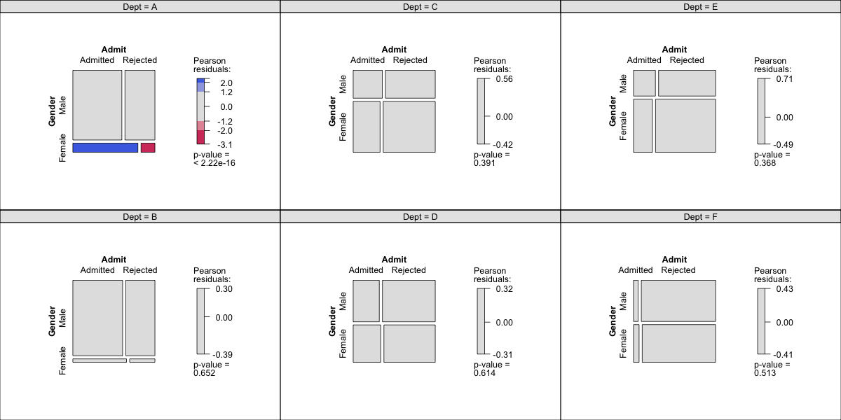
We want to know whether gender and admission are independent
conditional on department.
cotabplot(~ Gender + Admit | Dept, data = UCBAdmissions, gp = shading_max, margins = rep(0, 4))

The syntax for the cotab plot is that the variable to the right of
the | is the given variable (in this case,
Dept), and the variables to the left of the |
and to the right of the ~ are the two explanatory
variables.
Double decker plot
When we have one response variable that we are particularly
interested in, and if we want to see how the conditional probability
changes with the levels of several other factors, we can also use a
doubledecker plot.
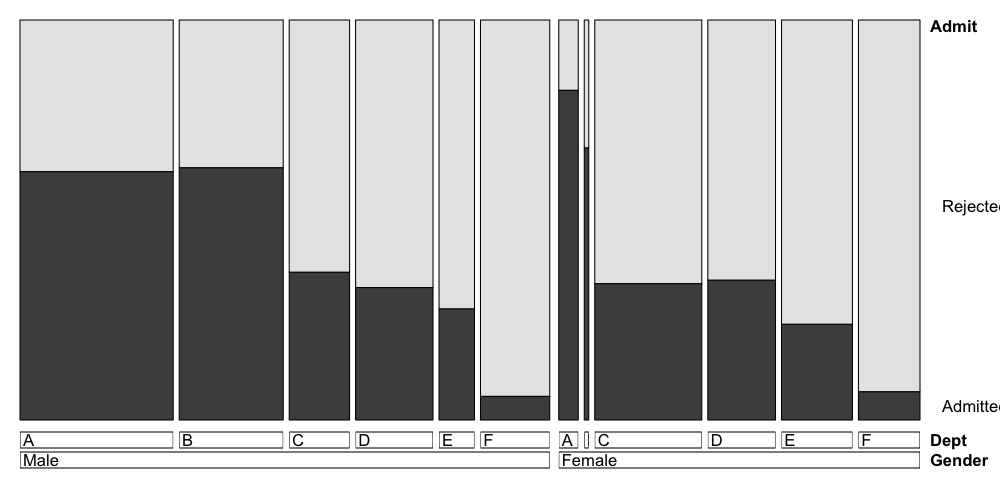
A doubledecker plot is like a mosaic plot, but the vertical axis
gives us the conditional probabilites of the response variable, and the
horizontal axis gives us the probabilities of all the remaining factor
combinations.
This can be helpful when we are more interested in comparing
conditional probabilities than we are in looking for conditional
independence.
Double decker plot for admissions data
We can try a doubledecker plot on the admissions data.
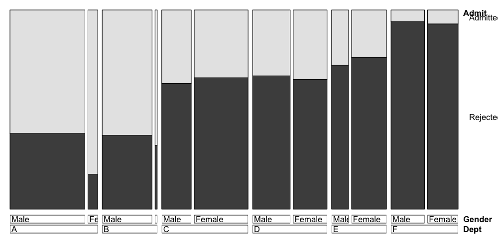
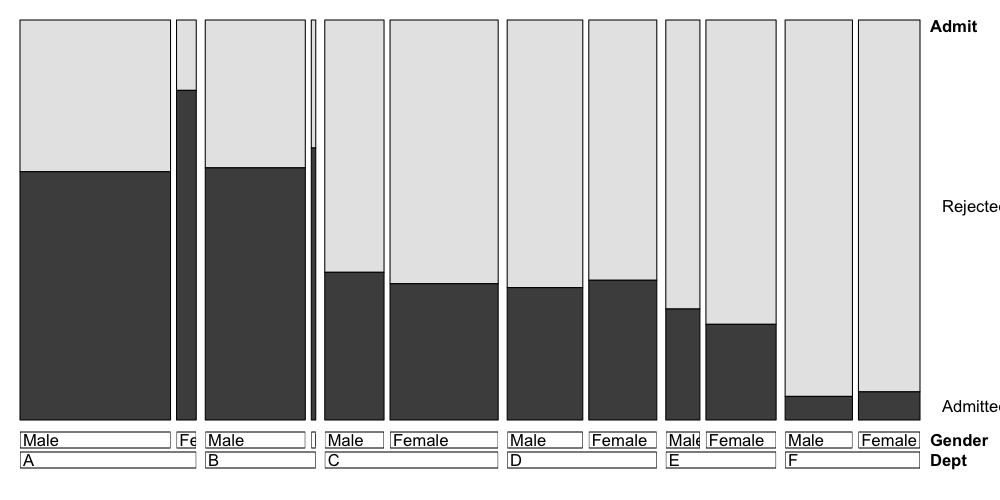
Here the height of the first bar gives the conditional probability of
admission given that the applicant was male and applying to Department
A, the height of the second bar gives the conditional probability of
admission given that the applicant was female and applying to Department
A, and so on.
The widths of the bars represent the probabilities of the categories:
the width of the first bar is proportional to the number of male
applicants to Department A, the width of the second bar is proportional
to the number of female applicants to Department B, and so on.
doubledecker(Admit ~ Dept + Gender, data = UCBAdmissions)

## nitpicky plotting modification: plots go in the same order as
## the array, so if we want admitted to be on bottom we need to
## switch the order of admit vs. rejected in the UCBAdmissions array
doubledecker(Admit ~ Dept + Gender, data = UCBAdmissions[2:1,,])

The syntax here is that the variable to the left of the
~ is plotted on the vertical axis, and the variables to the
right of the ~ are plotted on the vertical axis, with the
first factor being grouped first, and subsequent factors being grouped
within the previous factors.
The order you put the variables to the left of the ~
makes a big difference in what information you can easily read off the
plot. When we have Admit ~ Dept + Gender, it’s easy to see
the differences between male and female admissions within each
department because those bars are placed next to each other.
If we do it the other way around, we’re plotting the same
information, but it’s now easier to read off the differences in
admission rates by department instead of the differences in admission
rates by gender.
doubledecker(Admit ~ Gender + Dept, data = UCBAdmissions[2:1,,])

Overall
When working with categorical data:
- We are often thinking about visualizing departures from
independence
- Mosaic plots replace scatterplots
- Cotab plots replace coplots
- Doubledecker plots display conditional probabilities, and the
ordering of the factors is very important
