Stat 470/670 Lecture 16: Logistic regression part
2
Julia Fukuyama
Arsenic in wells
The file wells.dat contains data on 3,020 households in
Bangladesh whose wells had arsenic levels above the national drinking
water standard of 50 micrograms per liter. The variables are:
switch: the response: whether or not the household
switched after being encouraged to do so (after high arsenic was
measured.)
arsenic: the arsenic concentration in hundreds of
micrograms per liter.
dist: the distance to the nearest safe well in
meters.
assoc: whether anyone in the household is in a
community association.
educ: the years of education of the head of the
household.
We load at the data and look at the numerical summary and a pairs
plot:
library(GGally)
wells = read.table("../../datasets/wells.dat")
summary(wells)
##      switch          arsenic           dist             assoc
##  Min.   :0.0000   Min.   :0.510   Min.   :  0.387   Min.   :0.0000
##  1st Qu.:0.0000   1st Qu.:0.820   1st Qu.: 21.117   1st Qu.:0.0000
##  Median :1.0000   Median :1.300   Median : 36.761   Median :0.0000
##  Mean   :0.5752   Mean   :1.657   Mean   : 48.332   Mean   :0.4228
##  3rd Qu.:1.0000   3rd Qu.:2.200   3rd Qu.: 64.041   3rd Qu.:1.0000
##  Max.   :1.0000   Max.   :9.650   Max.   :339.531   Max.   :1.0000
##       educ
##  Min.   : 0.000
##  1st Qu.: 0.000
##  Median : 5.000
##  Mean   : 4.828
##  3rd Qu.: 8.000
##  Max.   :17.000
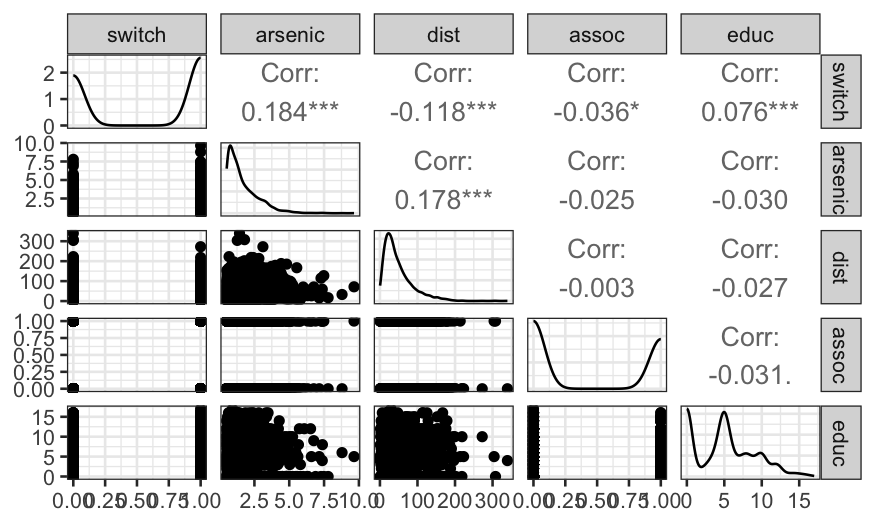
As we might expect, distance and education level are positively
associated with switching, while arsenic level is negatively associated.
Surprisingly, the correlation between belong to an association and
switching is negative, though the relationship is very weak.
Distance and arsenic levels should be the best predictors, so let’s
look more closely at the distributions of those variables.
ggplot(wells, aes(x = dist)) +
    geom_histogram(breaks = seq(0, 340, 10)) +
    xlab("Distance to nearest safe well (meters)")
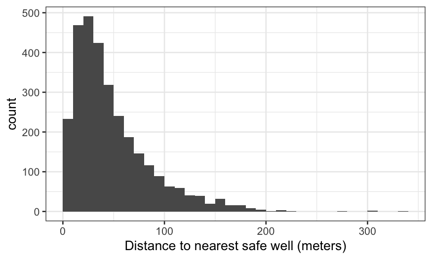
We see the distribution of distance peaks around 40–60 meters, then
is strongly right-skewed. We should keep the possibility of a
transformation in mind.
Then arsenic:
ggplot(wells, aes(x = arsenic)) +
    geom_histogram(breaks = seq(0, 10, 0.25)) + xlab("Arsenic concentration (100 mg/liter)")
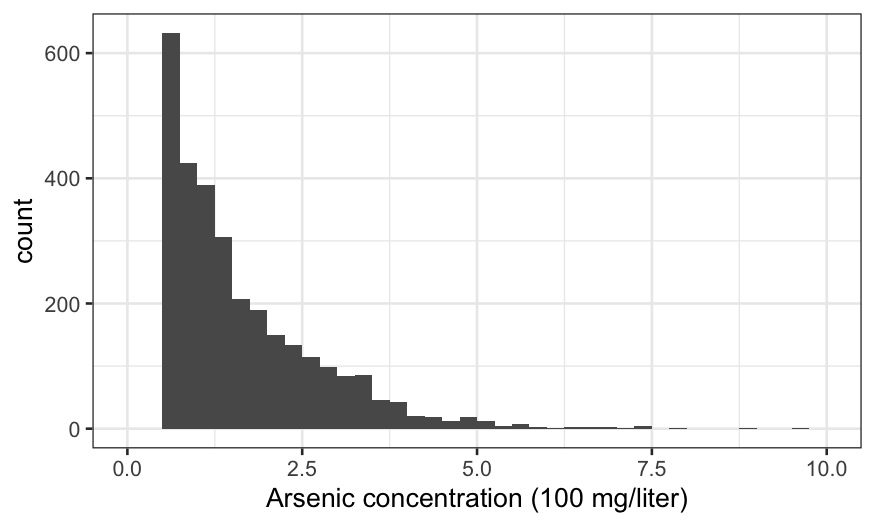
There are no observations with arsenic below 0.5, because these are
considered “safe” and the households don’t get advised to switch wells.
Otherwise, the distribution is against strongly right-skewed, suggesting
a transformation.
Note that the scales of dist and arsenic
are quite different. Some authors suggest standardizing the data for
interpretability, so that predictors are on approximately the same
scale. That’s not a bad idea but we will hold off for now.
And finally education:
ggplot(wells, aes(x = educ)) + geom_histogram(breaks = -0.5:17.5) +
    xlab("Years of education")
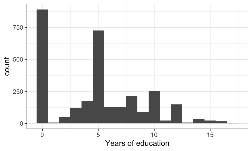
The distribution is weird. 0 (no education) and 5 (primary school
only) are the magic numbers.
Starting off simple
One way of approaching EDA is to throw everything into your model and
then get rid of terms you don’t need. Another strategy is to start with
simple models and gradually build up to complex models. Let’s take this
second approach for now.
We’ll start by predicting switching, using distance as the only
response. There’s no reason why we can’t try loess:
ggplot(wells, aes(x = dist, y = switch)) +
    geom_jitter(width = 0, height = 0.1) +
    geom_smooth(method = "loess") +
    xlab("Distance from nearest safe well") +
    ylab("Probability of switching")
## `geom_smooth()` using formula = 'y ~ x'
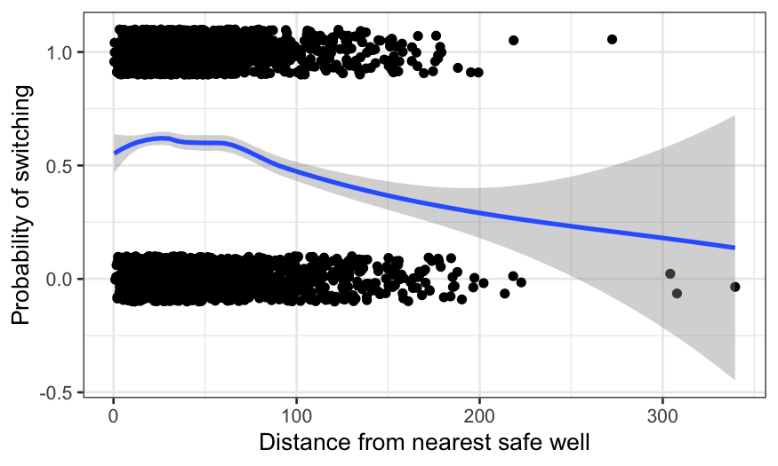
We can interpret the fit as the probability of switching wells, given
the distance to the nearest safe well. There’s a bump for very low
distances (which is probably just noise) and then a decline. We could
play around with the smoothing parameters to get something more
pleasant-looking. Instead, we’ll fit a logistic regression to guarantee
a decreasing relationship.
gg = ggplot(wells, aes(x = dist, y = switch)) +
    geom_jitter(width = 0, height = 0.1) +
    geom_smooth(method = "loess")
gg + geom_smooth(method = "glm", method.args = list(family = "binomial"), color = "orange") +
    xlab("Distance from nearest safe well") +
    ylab("Probability of switching")
## `geom_smooth()` using formula = 'y ~ x'
## `geom_smooth()` using formula = 'y ~ x'
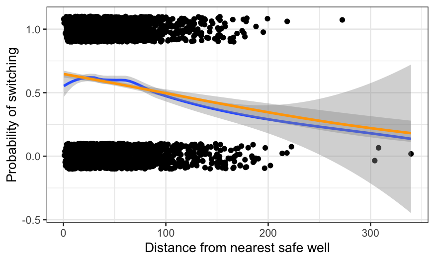
The parametric method imposes a functional form on the data. This
aids in interpretability: the fit can now be described in a couple of
parameters, and the weird bump at the beginning is gone. The cost is
some lack of fit: perhaps the probability should decrease more quickly
as the distance gets beyond about 60 meters (remember that water is
heavy and it’s tiring to carry buckets back and forth over long
distances.)
Let’s try the same kind of approach using arsenic concentration as
the sole predictor.
gg = ggplot(wells, aes(x = arsenic, y = switch)) +
    geom_jitter(width = 0, height = 0.1) +
    geom_smooth(method = "loess")
gg + geom_smooth(method = "glm", method.args = list(family = "binomial"), color = "orange") +
    xlab("Arsenic concentration") +
    ylab("Probability of switching")
## `geom_smooth()` using formula = 'y ~ x'
## `geom_smooth()` using formula = 'y ~ x'
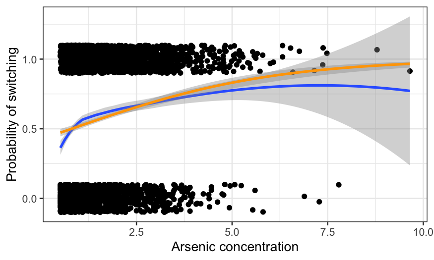
The fits diverge at arsenic levels above about 5. That seems to be
because of a couple of extremely high arsenic observations which led to
switching. Note however that not much of the data has arsenic above 5,
so it remains to be seen how much this matters.
Also note the difference in fits for low levels of arsenic. This is
more worrisome than the difference at high levels because there is
actually a lot of data there. It seems likely that there is a lack of
fit for the low concentrations that logistic regression can’t handle.
We’ll come back to this later.
Two predictors
We now want to know how the chance of switching depends on distance
and arsenic simulataneously. Before fitting a model, we plot the data to
get a feel for it. We’ll use color to distinguish between households
that switch and households that don’t.
ggplot(wells, aes(x = dist, y = arsenic, color = factor(switch))) +
    geom_point(alpha = 0.5) +
    xlab("Distance from nearest safe well") +
    ylab("Arsenic concentration") +
    labs(color = "Did they switch?") +
    scale_color_manual(values = c("#E69F00", "#56B4E9"), labels = c("No", "Yes"))
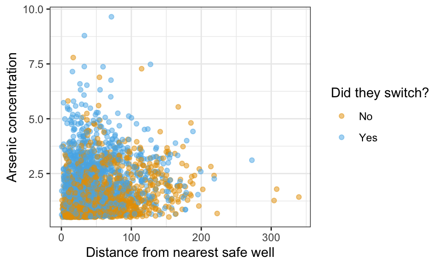
The alpha = 0.5 makes the points slightly transparent,
which can help visually when you have a lot of data. Still, it’s hard to
work out how switching depends on the other two variables from this
graph; that’s why we’re fitting a model. The main thing to take home
from the graph is the lack of data in the top right: we have no
observations at all with both distance above 200 and arsenic above 4, so
we should not try to generalize to this region.
Density plots are actually more useful for comparing the two
distributions, and we can use geom_density2d to make such a
plot:
ggplot(wells, aes(x = dist, y = arsenic, color = factor(switch))) +
    geom_density2d() +
    xlab("Distance from nearest safe well") +
    ylab("Arsenic concentration") +
    labs(color = "Did they switch?") +
    scale_color_manual(values = c("#E69F00", "#56B4E9"), labels = c("No", "Yes"))
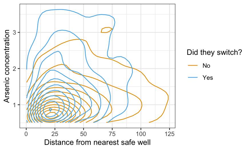
We can see that people who are closer to the nearest safe well and
people whose well has a higher arsenic level are more likely to switch,
but the plot is not ideal for this purpose. We can visualize the
probability of switching conditional on the nearest safe well more
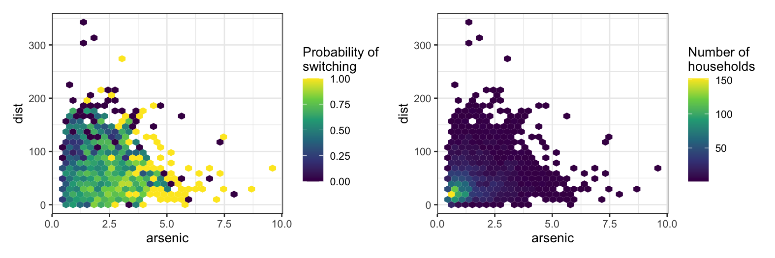
directly with a hexbin plot.
The first plot divides the space up into bins and computes the
fraction of people who switched in each bin. This is a (often very
crude) approximation of the conditional probability P(switch | distance,
arsenic), which is also what logistic regression is trying to
approximate.
The second plot is for reference and shows the number of samples we
have in each bin.
gg_prob = ggplot(wells, aes(x = arsenic, y = dist, z = switch)) +
    stat_summary_hex(fun = mean, bins = 30) +
    scale_fill_viridis_c(name = "Probability of\nswitching")
gg_num = ggplot(wells, aes(x = arsenic, y = dist)) +
    geom_hex(bins = 30) +
    scale_fill_viridis_c(name = "Number of\nhouseholds")
gg_prob + gg_num
Now we’ll fit a logistic regression using both distance and arsenic
as predictors. We first fit an additive model, i.e. with no
interaction.
switch.logit = glm(switch ~ dist + arsenic, family = "binomial", data = wells)
summary(switch.logit)
##
## Call:
## glm(formula = switch ~ dist + arsenic, family = "binomial", data = wells)
##
## Coefficients:
##              Estimate Std. Error z value Pr(>|z|)
## (Intercept)  0.002749   0.079448   0.035    0.972
## dist        -0.008966   0.001043  -8.593   <2e-16 ***
## arsenic      0.460775   0.041385  11.134   <2e-16 ***
## ---
## Signif. codes:  0 '***' 0.001 '**' 0.01 '*' 0.05 '.' 0.1 ' ' 1
##
## (Dispersion parameter for binomial family taken to be 1)
##
##     Null deviance: 4118.1  on 3019  degrees of freedom
## Residual deviance: 3930.7  on 3017  degrees of freedom
## AIC: 3936.7
##
## Number of Fisher Scoring iterations: 4
As always, the coefficients are the most important things here.
According to the model,
\[
\textrm{logit}[P(\textrm{switch}|{\textrm{dist, arsenic}})] = 0.003 -
0.00897 \times \textrm{dist} + 0.4608 \times \textrm{arsenic}.
\]
As in the continuous case, we visualize the fit by drawing multiple
curves representing different values of one of the predictors. Let’s
display the switching probability as a function of distance for a few
values of arsenic. Note that when we use the augment()
function, we specify type.predict = "response" to get the
probabilities and not their logits.
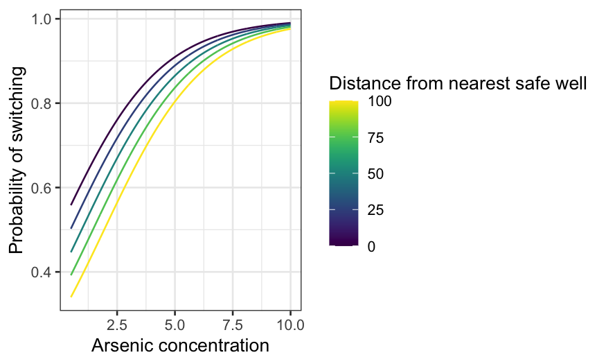
dist_df = expand.grid(dist = 0:339, arsenic = seq(0.5, 2.5, 0.5))
dist_preds = augment(switch.logit, type.predict = "response", newdata = dist_df)
ggplot(dist_preds, aes(x = dist, y = .fitted, group = arsenic, color = arsenic)) +
    geom_line() +
    xlab("Distance from nearest safe well") +
    ylab("Probability of switching") +
    labs(color = "Arsenic concentration") +
    scale_color_viridis()

The median arsenic level is 1.3. If arsenic is near the median, the
probability of switching declines from 60-something percent if you’re
right by a safe well to less than 10% if the nearest safe well is
hundreds of meters away.
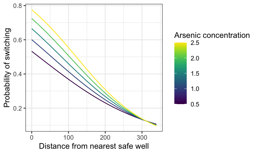
Now find prediction curves for arsenic for a few different
distances:
arsenic_df = expand.grid(arsenic = seq(0.5, 10, 0.01), dist = seq(0, 100, 25))
arsenic_pred = augment(switch.logit, type.predict = "response", newdata = arsenic_df)
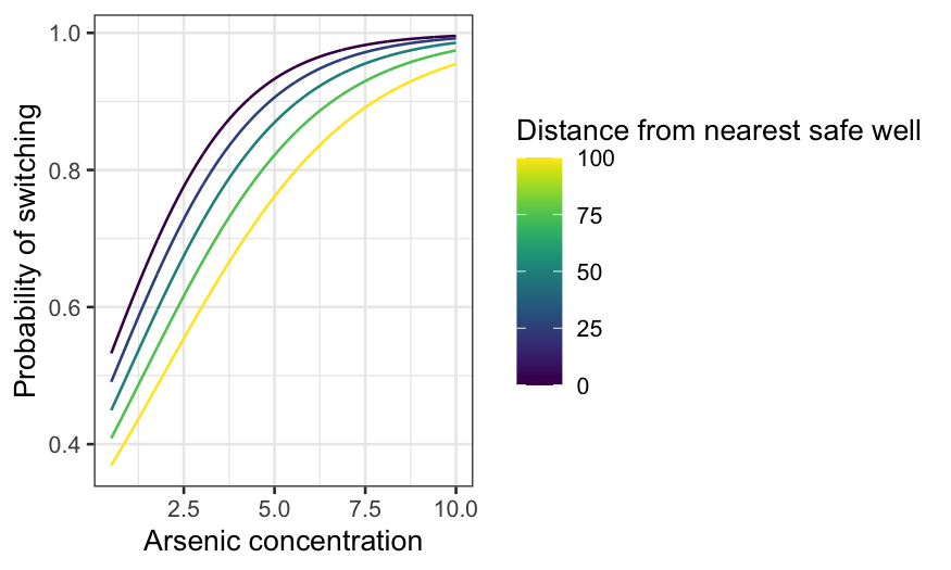
ggplot(arsenic_pred, aes(x = arsenic, y = .fitted, group = dist, color = dist)) +
geom_line() +
xlab("Arsenic concentration") +
ylab("Probability of switching") +
labs(color = "Distance from nearest safe well") + scale_color_viridis()
The median distance to a safe well is about 37 meters. At that
distance, if the arsenic level is only just over the safety threshold,
it’s about 50–50 whether a household switched. On the other hand, at the
highest levels of arsenic, households will almost certainly switch even
if the nearest safe well is quite far.
We can also visualize the fitted values as a function of distance and
arsenic together. We need to get predictions on a fine grid for this to
work.
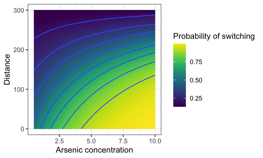
arsenic_df_fine = expand.grid(arsenic = seq(.5, 10, .01), dist = seq(0, 300, 1))
arsenic_pred = augment(switch.logit, type.predict = "response", newdata = arsenic_df_fine)
ggplot(arsenic_pred, aes(x = arsenic, y = dist, z = .fitted, fill = .fitted)) +
    geom_raster() +
    geom_contour() +
    xlab("Arsenic concentration") +
    ylab("Distance from nearest safe well") +
    labs(fill = "Probability of switching") + scale_fill_viridis()

Adding an interaction
We now add an interaction term between distance and arsenic.
switch_int = glm(switch ~ dist * arsenic, family = "binomial", data = wells)
summary(switch_int)
##
## Call:
## glm(formula = switch ~ dist * arsenic, family = "binomial", data = wells)
##
## Coefficients:
##               Estimate Std. Error z value Pr(>|z|)
## (Intercept)  -0.147868   0.117538  -1.258  0.20838
## dist         -0.005772   0.002092  -2.759  0.00579 **
## arsenic       0.555977   0.069319   8.021 1.05e-15 ***
## dist:arsenic -0.001789   0.001023  -1.748  0.08040 .
## ---
## Signif. codes:  0 '***' 0.001 '**' 0.01 '*' 0.05 '.' 0.1 ' ' 1
##
## (Dispersion parameter for binomial family taken to be 1)
##
##     Null deviance: 4118.1  on 3019  degrees of freedom
## Residual deviance: 3927.6  on 3016  degrees of freedom
## AIC: 3935.6
##
## Number of Fisher Scoring iterations: 4
The numbers are a bit hard to interpret. For example, the sign of the
interaction term is negative, but it’s hard to know exactly what this
means (especially since the signs for distance and arsenic go in
different directions.) The interpretation is easier if we just plot
curves.
dist_int = augment(switch_int, type.predict = "response", newdata = dist_df)
ggplot(dist_int, aes(x = dist, y = .fitted, group = arsenic, color = arsenic)) +
    geom_line() +
    xlab("Distance from nearest safe well") +
    ylab("Probability of switching") +
    labs(color = "Arsenic concentration") + scale_color_viridis()
The interaction brings the curves together as distance increases. If
the nearest safe well is close, it makes a big difference whether the
arsenic concentration is just over the limit or much bigger. If the
nearest safe well is far, it makes little difference: people are
unlikely to switch no matter the concentration. The curves meet up
beyond 300 meters, though we only have three observations where the
distance exceeds 300 meters.
arsenic_int_pred = augment(switch_int, type.predict = "response", newdata = arsenic_df)
ggplot(arsenic_int_pred, aes(x = arsenic, y = .fitted, group = dist, color = dist)) +
    geom_line() +
    xlab("Arsenic concentration") +
    ylab("Probability of switching") +
    labs(color = "Distance from nearest safe well") + scale_color_viridis()
The curves actually get further apart at first as arsenic increases
(up to a point.) That is, the curves for short distances rise quite
quickly as arsenic increases, while the curves for long distances rise
more slowly. Eventually, for exceptionally high levels of arsenic, the
curves come together (because they can’t go any higher than 1.)
As before, we can also visualize the fitted values as a function of
both predictors.
arsenic_df_fine = expand.grid(arsenic = seq(.5, 10, .01), dist = seq(0, 300, 1))
arsenic_pred = augment(switch_int, type.predict = "response", newdata = arsenic_df_fine)
ggplot(arsenic_pred, aes(x = arsenic, y = dist, z = .fitted, fill = .fitted)) +
    geom_raster() +
    geom_contour() +
    xlab("Arsenic concentration") +
    ylab("Distance") +
    labs(fill = "Probability of switching") + scale_fill_viridis()
Lots of predictors
Distance and arsenic are both good predictors and there’s no reason
to think there shouldn’t be an interaction, so keep the interaction
term. Now let’s add assoc and educ to the
model and see if the fit makes sense.
summary(glm(switch ~ dist * arsenic + assoc + educ, family = "binomial", data = wells))
##
## Call:
## glm(formula = switch ~ dist * arsenic + assoc + educ, family = "binomial",
##     data = wells)
##
## Coefficients:
##               Estimate Std. Error z value Pr(>|z|)
## (Intercept)  -0.291120   0.131427  -2.215  0.02675 *
## dist         -0.006081   0.002093  -2.905  0.00367 **
## arsenic       0.553238   0.069542   7.955 1.79e-15 ***
## assoc        -0.123188   0.076977  -1.600  0.10953
## educ          0.041948   0.009594   4.372 1.23e-05 ***
## dist:arsenic -0.001612   0.001022  -1.577  0.11482
## ---
## Signif. codes:  0 '***' 0.001 '**' 0.01 '*' 0.05 '.' 0.1 ' ' 1
##
## (Dispersion parameter for binomial family taken to be 1)
##
##     Null deviance: 4118.1  on 3019  degrees of freedom
## Residual deviance: 3905.4  on 3014  degrees of freedom
## AIC: 3917.4
##
## Number of Fisher Scoring iterations: 4
Years of education has a positive coefficient, which makes sense. We
can keep that in the model.
Association membership has a weak negative coefficient, and
we can probably make a causal story to explain either a positive or
negative coefficient here. If our sole goal was prediction, we could do
a careful cross-validation to see if association membership did help
predict more accurately. Since we’re doing EDA, we can drop the
association term.
summary(glm(switch ~ dist * arsenic + educ, family = "binomial", data = wells))
##
## Call:
## glm(formula = switch ~ dist * arsenic + educ, family = "binomial",
##     data = wells)
##
## Coefficients:
##               Estimate Std. Error z value Pr(>|z|)
## (Intercept)  -0.349044   0.126360  -2.762  0.00574 **
## dist         -0.006047   0.002095  -2.886  0.00390 **
## arsenic       0.555367   0.069531   7.987 1.38e-15 ***
## educ          0.042306   0.009581   4.415 1.01e-05 ***
## dist:arsenic -0.001629   0.001023  -1.592  0.11145
## ---
## Signif. codes:  0 '***' 0.001 '**' 0.01 '*' 0.05 '.' 0.1 ' ' 1
##
## (Dispersion parameter for binomial family taken to be 1)
##
##     Null deviance: 4118.1  on 3019  degrees of freedom
## Residual deviance: 3907.9  on 3015  degrees of freedom
## AIC: 3917.9
##
## Number of Fisher Scoring iterations: 4
We now add the remaining two-way interactions. In general, if you
only have a few terms, you might as well include all the two-way
interactions unless you have a good reason not to.
switch_model = glm(switch ~ dist + arsenic + educ + dist:arsenic + dist:educ + arsenic:educ,
    family = "binomial", data = wells)
At this point our model is too complicated for it to be worth trying
to interpret the numbers. Let’s extract the fitted values and residuals,
and plot the latter against the former. Note that the default of
augment() is to extract the deviance residuals instead of
the response residuals, if you know about and prefer deviance residuals
you can specify them instead.
switch_model_df = augment(switch_model, type.residuals = "pearson")
ggplot(switch_model_df, aes(x = .fitted, y = .resid)) +
    geom_point() +
    geom_smooth(method = "loess", method.args = list(degree = 1)) +
    xlab("Fitted values") +
    ylab("Residuals")
## `geom_smooth()` using formula = 'y ~ x'
The points on the plot fall exactly on two lines, so look at the
smooth instead. We see there’s a little bit of waviness. This is fairly
typical for logistic regression: there’s no reason why the relationship
between probability and the predictors should have that exact functional
form.
Now plot the residuals against distance. What we’re looking for here
is whether the function form is correct, or whether we need more
flexibility in how we use distance to predict switching.
ggplot(switch_model_df, aes(x = dist, y = .resid)) +
    geom_point() +
    geom_smooth(method = "loess", method.args = list(degree = 1)) +
    xlab("Distance from nearest safe well") +
    ylab("Residuals")
## `geom_smooth()` using formula = 'y ~ x'
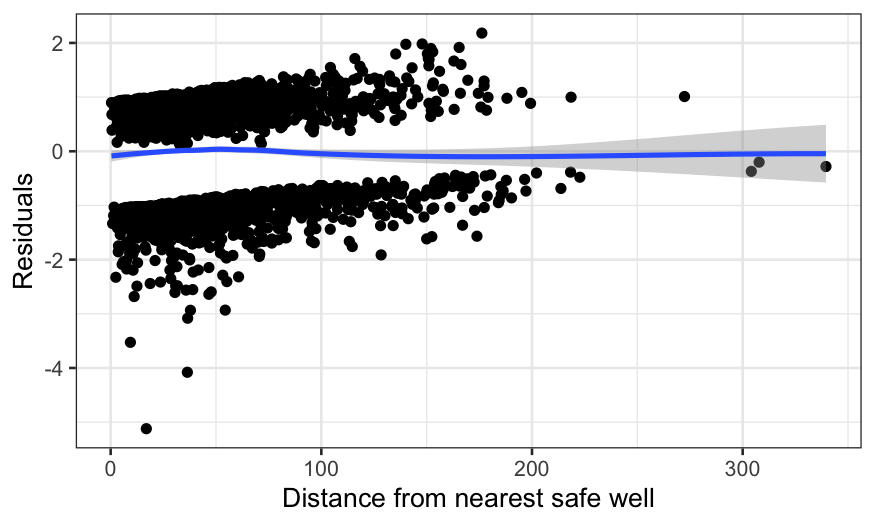
ggplot(switch_model_df, aes(x = dist, y = .resid)) +
    geom_smooth(method = "loess", method.args = list(degree = 1)) +
    xlab("Distance from nearest safe well") +
    ylab("Residuals")
## `geom_smooth()` using formula = 'y ~ x'
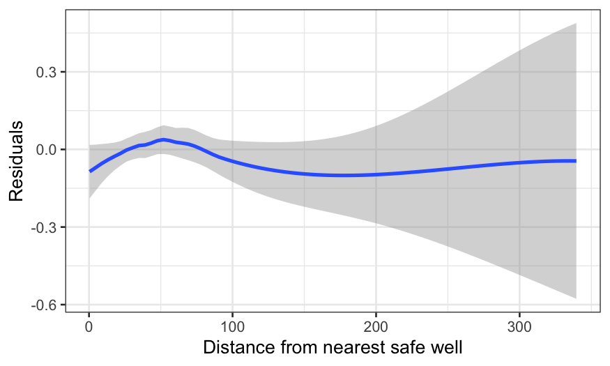
There’s a wiggle, but this is basically fine – the zero line is
enclosed in the confidence band.
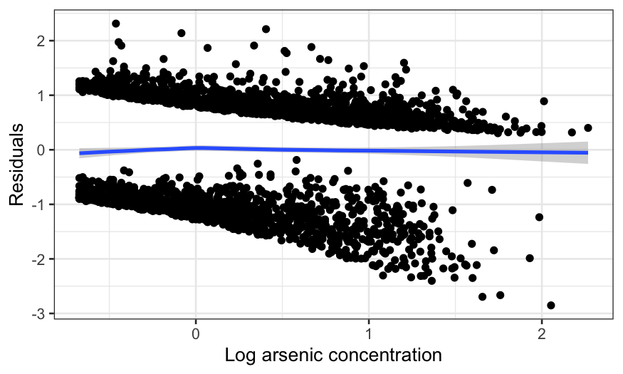
Now let’s do the same plot with arsenic on the \(x\)-axis:
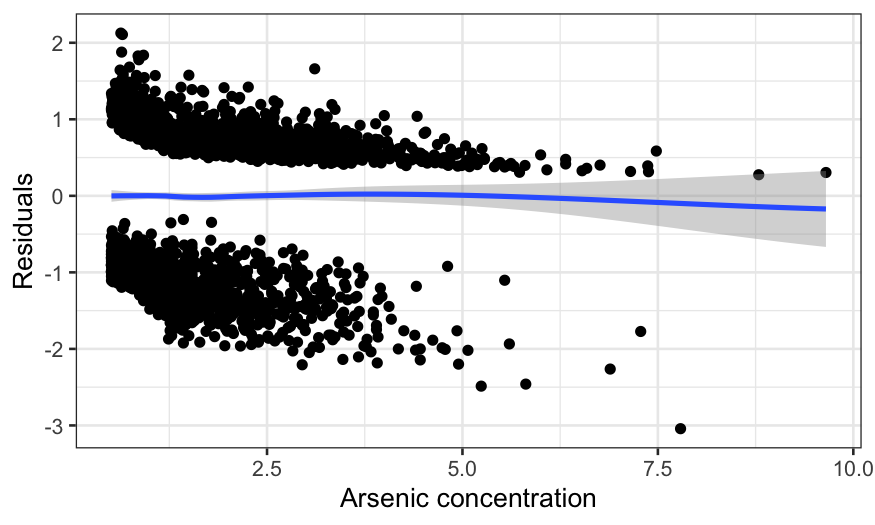
ggplot(switch_model_df, aes(x = arsenic, y = .resid)) +
    geom_point() +
    geom_smooth(method = "loess", method.args = list(degree = 1)) +
    xlab("Arsenic concentration") +
    ylab("Residuals")
## `geom_smooth()` using formula = 'y ~ x'
ggplot(switch_model_df, aes(x = arsenic, y = .resid)) +
    geom_smooth(method = "loess", method.args = list(degree = 1)) +
    xlab("Arsenic concentration") +
    ylab("Residuals") + xlim(c(0, 5)) + geom_vline(aes(xintercept = 1.35))
## `geom_smooth()` using formula = 'y ~ x'
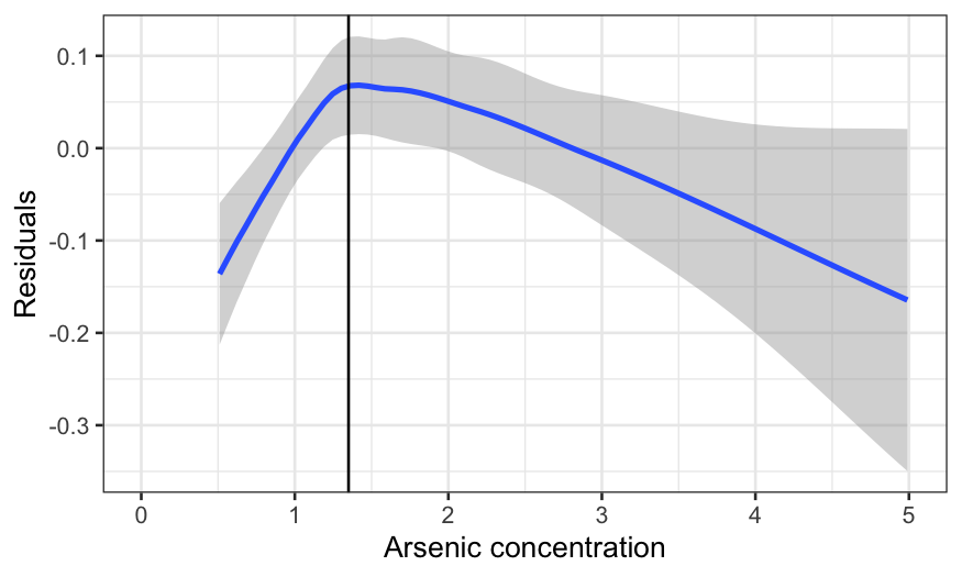
This is worse. The curve is too low, then rises too high, then
declines again. In fact, the extreme left hand side is the biggest
problem, since the lack is fit is real and the data is dense there. The
negative average residual there means that for arsenic levels just over
the threshold, the probability of switching is overestimated
(negative average residuals occur when there are more zeroes in the
response than the model expects.)
Education isn’t that interesting since the effect is much smaller,
but let’s do it for completeness.
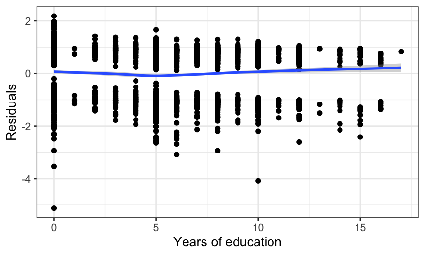
ggplot(switch_model_df, aes(x = educ, y = .resid)) +
    geom_point() +
    geom_smooth(method = "loess", method.args = list(degree = 1)) +
    xlab("Years of education") +
    ylab("Residuals")
## `geom_smooth()` using formula = 'y ~ x'
Again, the fit is imperfect.
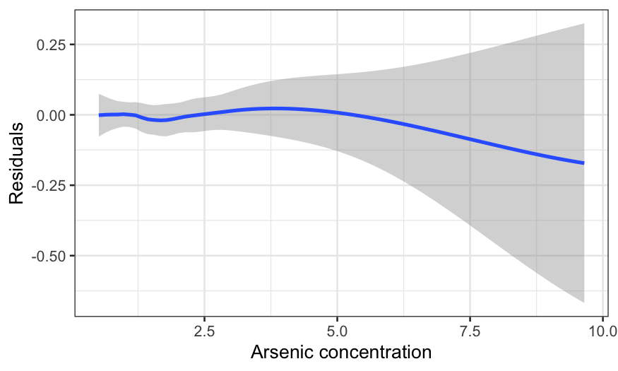
The last couple of graphs suggest that there is a different sort of
behavior for levels of arsenic above 1.35 and levels of arsenic below
1.35. We need a different slope for those two regimes, so we’ll make a
little function that lets us add a “knot” at 1.35 and have a different
slope for the two regimes.
amount_over_135 = function(x) ifelse(x > 1.35, x - 1.35, 0)
knot_model = glm(switch ~ dist + arsenic + I(amount_over_135(arsenic)) + educ, data = wells, family = "binomial")
knot_model_df = augment(knot_model, type.residuals = "pearson", type.predict = "response")
We can look at the residuals again, and we see that this completely
cleans up the non-linearity.
ggplot(knot_model_df, aes(x = arsenic, y = .resid)) +
    geom_point() +
    geom_smooth(method = "loess", method.args = list(degree = 1))  +
    xlab("Arsenic concentration") +
    ylab("Residuals")
## `geom_smooth()` using formula = 'y ~ x'
ggplot(knot_model_df, aes(x = arsenic, y = .resid)) +
    geom_smooth(method = "loess", method.args = list(degree = 1))  +
    xlab("Arsenic concentration") +
    ylab("Residuals")
## `geom_smooth()` using formula = 'y ~ x'
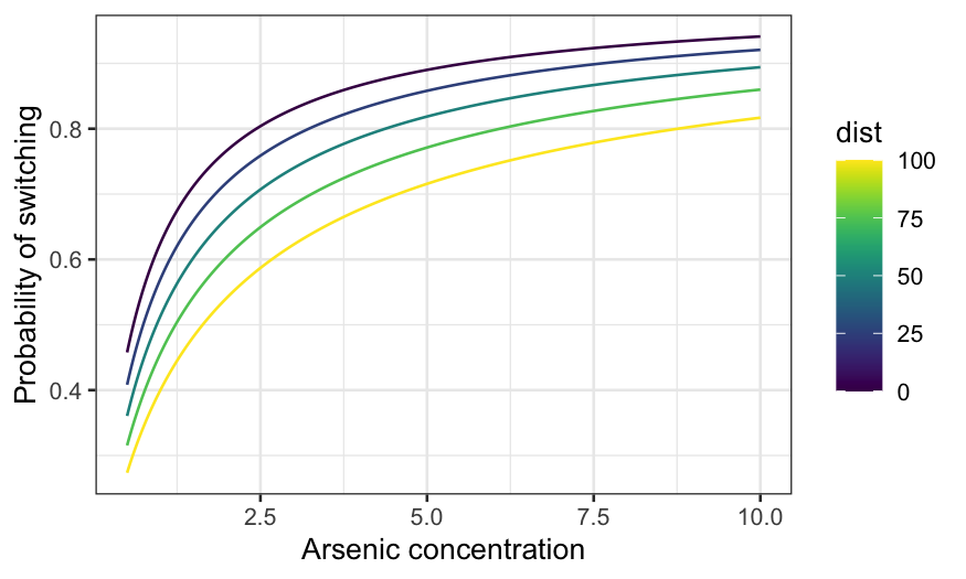
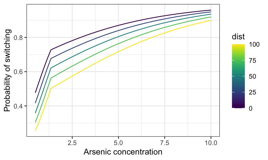
Let’s take a look at the fit. Fix education at its median, and draw
arsenic curves for several distances:
switch_grid = expand.grid(arsenic = seq(0.5, 10, 0.01), dist = seq(0, 100, 25), educ = 5)
knot_pred_grid = augment(knot_model, newdata = switch_grid,
    type.predict = "response", type.residuals = "pearson")
ggplot(knot_pred_grid, aes(x = arsenic, y = .fitted, group = dist, color = dist)) +
    geom_line() +
    xlab("Arsenic concentration") +
    ylab("Probability of switching") + scale_color_viridis()
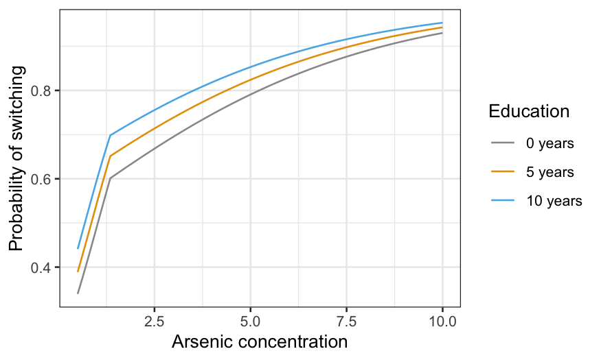
There are 3! ways you can assign the three variables to \(x\)-axis, conditioning variable, and fixed.
You probably get the idea at this point, though, so let’s just do one
more:
switch_grid_2 = expand.grid(arsenic = seq(0.5, 10, 0.01), dist = median(wells$dist), educ = c(0, 5, 10))
knot_pred_grid_2 = augment(knot_model, newdata = switch_grid_2,
    type.predict = "response", type.residuals = "pearson")
ggplot(knot_pred_grid_2,
       aes(x = arsenic, y = .fitted, group = educ, color = factor(educ))) +
    geom_line() +
    xlab("Arsenic concentration") +
    ylab("Probability of switching") +
    labs(color = "Education") +
    scale_color_manual(values = c("#999999", "#E69F00", "#56B4E9"),
                       labels = c("0 years", "5 years", "10 years"))
Improving the model
If you really care about prediction but still want to be able to
interpret the model, try a nonparametric model such as a generalized
additive model (GAM) or loess. To overgeneralize, GAM is often
better/easier when you have lots of predictors, while loess is often
better/easier when you have complex interactions. You can learn more
about these in S425/625.
If you really, really care about predictions then you can use machine
learning techniques. The improvement in prediction is usually quite
small, however, and you’ll lose a lot or all the interpretability.