Stat 470/670 Lecture 15: Binary data and logistic
regression
Julia Fukuyama
Problem setup
We are interested in understanding voting patterns, and in particular
how vote for president is related to income.
There is data on this topic in the ANES
dataset: for each election, they have demographic information on a
subset of voters plus information about how they voted in the
presidential elections.
The variables here have particularly uninformative names, but the
ones we are interested in describe the year, income, and presidential
vote. They are coded as:
The primary difference between our task here and the modeling that
we’ve done earlier in the semester is that the variable we’re trying to
predict, vote, is binary. That is, it only takes two values (here vote
for Republicans vs. vote for Democrats) instead of taking as a value any
real number. This turns out to be enough of a difference that we need a
new modeling technique.
Income is measured on a scale from 1 to 5:
1: 0 to 16 percentile
2: 17 to 33 percentile
3: 34 to 67 percentile
4: 68 to 95 percentile
5: 96 to 100 percentile
Using percentiles allows comparability between years. Also note that
this is really an ordinal variable but we might find some advantages in
treating it as quantitative.
ANES = read.csv("anes.csv")
income = ANES$VCF0114
## income = 0 means NA, per the codebook
income[income == 0] = NA
summary(income)
##    Min. 1st Qu.  Median    Mean 3rd Qu.    Max.    NA's
##   1.000   2.000   3.000   2.864   4.000   5.000    5749
table(income) / length(income)
## income
##          1          2          3          4          5
## 0.16227427 0.15051888 0.30039282 0.25417742 0.04837008
Next we need the year for each observation. This is VCF0004.
year = ANES$VCF0004
summary(year)
##    Min. 1st Qu.  Median    Mean 3rd Qu.    Max.
##    1948    1972    1990    1990    2012    2020
The coding is that “1” means the Democrat, “2” means the Republican,
and “0” or “NA” means some other outcome. We want everything to be coded
as 0, 1, or NA (using 0/1 coding is the standard way to code binary
variables for logistic regression).
vote = ANES$VCF0704a
##  First, change the zeroes to NA’s:
vote[vote == 0] = NA
## Then, to go from 2 representing Republican and 1 representing Democrat to 1 = Republican, 0 = Democrat, we just have to subtract 1
vote = vote - 1
summary(vote)
##    Min. 1st Qu.  Median    Mean 3rd Qu.    Max.    NA's
##    0.00    0.00    0.00    0.47    1.00    1.00   37279
The variable really represents the fraction of the two-party vote
that was for Republicans now, so for clarity let’s just rename it as
such.
Let’s put everything in a data frame, and then filter to just
presidential election years:
ANES_df = data.frame(year, income, Republican)
ANES_df = filter(ANES_df, year %in% seq(1948, 2020, 4))
summary(ANES_df)
##       year          income        Republican
##  Min.   :1948   Min.   :1.000   Min.   :0.000
##  1st Qu.:1976   1st Qu.:2.000   1st Qu.:0.000
##  Median :2000   Median :3.000   Median :0.000
##  Mean   :1994   Mean   :2.855   Mean   :0.469
##  3rd Qu.:2016   3rd Qu.:4.000   3rd Qu.:1.000
##  Max.   :2020   Max.   :5.000   Max.   :1.000
##                 NA's   :2824    NA's   :16555
Visualizing the relationship with one predictor
The first question we can ask is about the relationship between
income and the probability of voting Republican in 1992. Let’s start off
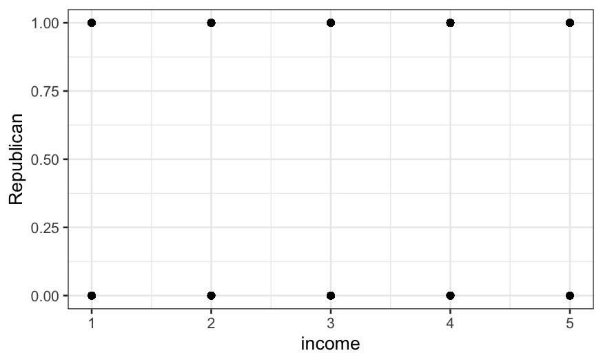
just by plotting the two points. It turns out that this isn’t trivial
because the variables are categorical, and we need to do some work to
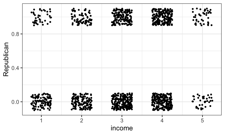
get anything useful. Jittering helps with categorical variables, and we
use it here:
ANES92 = subset(ANES_df, year == 1992)
ggplot(ANES92, aes(x = income, y = Republican)) +
    geom_point()

ggplot(ANES92, aes(x = income, y = Republican)) +
    geom_jitter(height = 0.1, width = 0.25, size = .7)

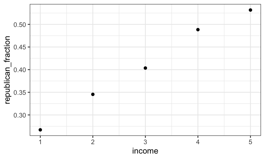
The jittered plot is ok, but here it’s actually more useful to
compute the fraction of the vote going to Republicans and either look at
the table or plot those values.
(republican_fraction_by_income = ANES92 %>%
     group_by(income) %>%
     summarise(republican_fraction = mean(Republican, na.rm = TRUE)))
## # A tibble: 6 × 2
##   income republican_fraction
##    <int>               <dbl>
## 1      1               0.267
## 2      2               0.345
## 3      3               0.404
## 4      4               0.488
## 5      5               0.532
## 6     NA               0.433
## zero values for income mean missing
ggplot(subset(republican_fraction_by_income, income != 0)) +
    geom_point(aes(x = income, y = republican_fraction))

How could we model this relationship?
This gives the proportion (out of major party voters) who voted for
Bush for each income group. Aside from group zero, which represents
missing values of income, we see a strictly increasing pattern. How do
we model this? Three options (not the only three) include:
- Linear regression with income as a numerical predictor.
- Logistic regression with income as a numerical predictor.
- Regression with income as a categorical (factor) predictor. (In this
linear and logistic give identical predictions.)
Method 1 is the easiest to interpret: we get a slope that directly
tells us the change in model probability of voting Republican as income
goes up one category. However, linear regression for binary responses
has two big limitations:
- The technical limitation is that it only works well when
probabilities are far from 0 and 1. Otherwise, if \(x\) is unbounded, you can end up with
negative probabilities or probabilities greater than 1.
- There is also a social limitation in that statisticians will be
quite upset with you and your work if you use linear regression to model
binary data.
Method 3 isn’t really a model at all: it just returns the proportion
within each category who voted for Bush, the same as our
summarise() call gave us above. There’s something to be
said for not fitting restrictive models when you don’t have to. However,
if our goal is to fit more complex models or make comparisons between
different sets of data, as it eventually will be, then some degree of
simplification may be useful to understand the patterns in the data. Or
we might fit a simplifying model first, then go back and look at the
data in more detail and see if there are any important features our
model missed. That will be our basic approach here.
Method 2, logistic regression, should work well. It does require
treating a predictor that isn’t inherently a numeric variable as
numeric, and requires a parametric form (effects are linear on a logit
scale.) However, most of the time, doing this is reasonable as long as
the pattern of the probability with \(x\) is monotonic and as long as predictive
accuracy is not the sole goal.
Logistic regression with one predictor
We fit such a logistic regression using income as a quantitative
variable and omitting missing values. Logistic regression is a special
case of a GLM, so we use the glm() function; specifying a
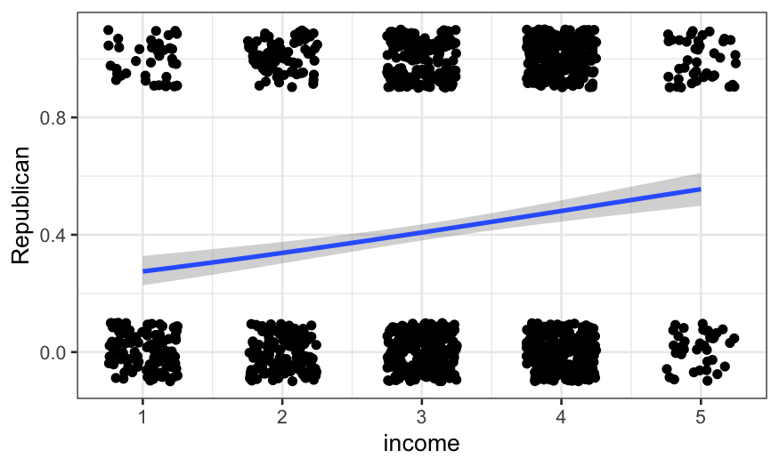
binomial family fits a logistic regression by default. Firstly, we can
just add the fitted curve to the jittered plot:
ggplot(ANES92, aes(x = income, y = Republican)) +
    geom_jitter(height = 0.1, width = 0.25) +
    geom_smooth(method = "glm", method.args = list(family = "binomial"))
## `geom_smooth()` using formula = 'y ~ x'

We can also fit it explicitly:
logit_92 = glm(Republican ~ income, family = binomial, data = ANES92)
summary(logit_92)
##
## Call:
## glm(formula = Republican ~ income, family = binomial, data = ANES92)
##
## Coefficients:
##             Estimate Std. Error z value Pr(>|z|)
## (Intercept) -1.26750    0.17789  -7.125 1.04e-12 ***
## income       0.29802    0.05379   5.541 3.01e-08 ***
## ---
## Signif. codes:  0 '***' 0.001 '**' 0.01 '*' 0.05 '.' 0.1 ' ' 1
##
## (Dispersion parameter for binomial family taken to be 1)
##
##     Null deviance: 1719.1  on 1266  degrees of freedom
## Residual deviance: 1687.2  on 1265  degrees of freedom
##   (1218 observations deleted due to missingness)
## AIC: 1691.2
##
## Number of Fisher Scoring iterations: 4
The summary gives a lot of information; we’ll focus on the
coefficients. The summary tells us that
\[
\text{logit}[P(\text{Republican})]=−1.27+0.298\times \text{income}
\]
where the logit function is
\[
\text{logit}(x)=\text{log}_e [x/(1−x)]
\]
To find \(P(\text{Republican})\), we
invert the logit:
\[
P(\text{Republican})=\text{logit}^{-1} (-1.27 + 0.298 \times
\text{income})
\]
where \[
\text{logit}^{-1}(y) = \frac{e^y}{1+e^y}
\]
For a quick and dirty interpretation, the “divide by 4” rule is
useful: the maximum change in probability associated with a one unit
change in \(x\) is the coefficient of
\(x\) divided by four. So going one
income group changes the model probability by up to about 7.5%. This
looks like it’s about the increase in the curve from income group 4 to
group 5.
We can check how good the approximation is:
## the package boot has the inv.logit function
library(boot)
## P(Republican) evaluated at income = 4
inv.logit(-1.27 + 0.298 * 4)
## [1] 0.4805099
## P(Republican) evaluated at income = 5
inv.logit(-1.27 + 0.298 * 5)
## [1] 0.5547792
Fitting a series of regressions
We’re not just interested in 1992. We want to know the relationship
between income and vote for every Presidential election we have data for
– is the relationship similar for every election, or are some elections
different? Has there been a consistent change over time?
In programming terms, the easiest way to fit the same model on many
subsets of the data is to write a function that subsets the data and
fits the model, then to write a for loop to fit the model for each
subset. There are much more computationally efficient approaches, but
otherwise more efficiency usually isn’t worth the effort.
Here’s a function to fit our weighted logistic regression of vote on
income for any given year.
logit_ANES_subset = function(my_year, data) {
    ## newdata = the subset of the data corresponding the year in question
    newdata = subset(data, year == my_year)
    ## model where the data are a subset corresponding to my_year
    model = glm(Republican ~ income, family = binomial,
        data = newdata)
    ## getting just the output from the logistic regression fit that we need
    output = c(my_year, summary(model)$coef[2, 1:2])
    return(output)
}
The function returns the year, the model’s coefficient for income,
and the standard error of that coefficient. We shouldn’t take the
standard error too literally, because we haven’t accounted for the
complex design of the ANES surveys.
Let’s test the function out on 1992 (Bush-Clinton).
logit_ANES_subset(my_year = 1992, data = ANES_df)
##                  Estimate   Std. Error
## 1.992000e+03 2.980249e-01 5.378931e-02
Once we’ve checked that it works, we can loop over every presidential
election year in our dataset: every four years between 1948 and
2012:
years = seq(1948, 2020, 4)
n = length(years)
income_by_year = data.frame(year = rep(NA, n), income_coef = rep(NA, n), income_se = rep(NA, n))
for (J in 1:n) {
    my_year = years[J]
    income_by_year[J, ] = logit_ANES_subset(my_year = my_year, data = ANES_df)
}
We’ll display the results using ggplot.
geom_errorbar() lets us add one standard error bounds. We
shouldn’t take these too literally, just use them to get a ballpark idea
of uncertainty.
gg = ggplot(income_by_year, aes(x = year, y = income_coef, ymin = income_coef -
    income_se, ymax = income_coef + income_se))
gg + geom_errorbar(width=1) +
    ylab("Coefficient of income in linear model")

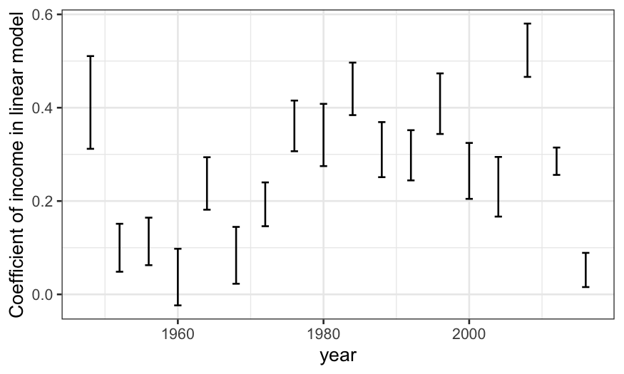
The income coefficient is positive for every election, meaning richer
people were more likely to vote Republican every time (though 1960 was
close.) The general trend was an increase in the income coefficient from
1952 to 1984, then a leveling-off. There was a huge drop from 1948 to
1952; unfortunately we don’t have data from before 1948 to know if the
election was typical.
Less modeling, more detail
In our regressions, we treated income as a quantitative variable. A
simpler approach would be to treat it as a factor, and simply track the
weighted proportion of each income group that (two-party) voted
Republican by year. Again, this is easiest to program (if inefficient)
using a for loop.
To find means, I used use mean() in conjunction with
summarise() in dplyr. Let’s first work out how to do it for
the 1992 data.
summarise(group_by(ANES92, factor(income)), prop_Republican = mean(Republican, na.rm = TRUE))
## # A tibble: 6 × 2
##   `factor(income)` prop_Republican
##   <fct>                      <dbl>
## 1 1                          0.267
## 2 2                          0.345
## 3 3                          0.404
## 4 4                          0.488
## 5 5                          0.532
## 6 <NA>                       0.433
income_prop = ANES_df %>%
    group_by(income, year) %>%
    summarise(prop_Republican = mean(Republican, na.rm = TRUE))
## `summarise()` has grouped output by 'income'. You can override using the
## `.groups` argument.
## clean up a bit
income_prop = income_prop %>%
    ## making income an ordered factor will give a nice color scale for us later
    mutate(income_ord = factor(income, levels = 1:5, ordered = TRUE))
gg = ggplot(income_prop, aes(x = year, y = prop_Republican, group = income_ord, color = income_ord)) +
    geom_point() + geom_line()
gg + ylab("Proportion of two-party vote\nfor Republicans") + labs(color = "Income percentile")

We now have a bit more detail on the trends and the aberrant
results.
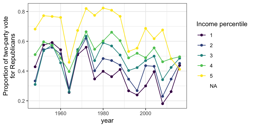
- Before 2012, the top income group is reliably the most Republican,
but the bottom income group isn’t always the most Democratic (although
it was in the middle part of the time period.)
- In 1948 there were pretty big differences between income groups, but
in the 1950s the differences between all groups except the richest were
small. It’s guess work whether 1948 was an aberration or whether the
small income differences from 1952 to 1968 were historically unusual
(though I suspect it’s the latter.)
- The big coefficient for 1964 (compared to the elections before and
after) is attributable to the fourth income group having a higher
Republican vote share.
- In 2008 there really was a big difference between income group,
which might be attributable to the financial crisis.
- Precipitous drop in fraction of the highest-income group voting for
Republicans after 2008. Possibly education polarization.
We can also plot income groups by year. Because there are so many
different years, we’ll facet them rather than color them.
ggplot(income_prop, aes(x = income, y = prop_Republican)) +
    geom_point() +
    facet_wrap(~ year, ncol = 6) + ylab("Proportion of two-party vote for Republican")

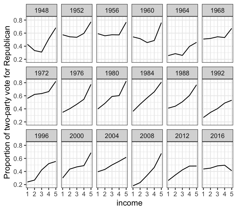
This yields less insight, but still has interesting features: notably
the big magnitude of the uptick in Republican vote share in the highest
income group is pretty consistent until 2008, after which the Republican
vote share as a function of income starts to flatten out.
Data summaries vs. data models
Both data summaries (like our last plot) and models (like our
logistic regressions) have their uses.
- Data summaries require fewer assumptions, and often give you a
fuller picture than a model. However, they can be noisy or just too
complicated to easily get a grip on.
- Models require assumptions, so in addition to being reductive,
there’s more potential for things to go horribly wrong. However, models
can be a easy way into the data: everything gets summarized in a couple
of parameters, and you can put your effort into understanding what those
parameters really mean. Furthermore, complexity can easily be added to
models – for example, it’s easy to build a logistic regression model
with multiple predictors (as we’ll see in the next lecture.)
In practice, going back and forth between models and data summaries,
as we did here, is often very useful in exploratory work. Models can
usefully simplify the data so you can get the big picture. Then you can
look a fuller data summary and bear in results that the big picture
doesn’t explain.
