Stat 470/670 Lecture 13: Level plots and contour
plots for trivariate data
Julia Fukuyama
Level plots and contour plots
Reading: Cleveland pp. 228-241, 245-248, 257-266, 270
Today: Two new kinds of plots
We’ll use them to plot
- Surfaces (e.g. output from a smoother)
Another theme that runs through the examples today: data is not
collected at even intervals, and it helps to look in places where you
have data.
Level plots
We still have three continuous variables, two “explanatory”
variables, \(u\) and \(v\), and one “response” variable, \(y\).
Before, we made coplots, with
- \(y\) on the vertical axis,
- \(u\) on the horizontal axis,
- Facets defined by cuts of \(v\).
These are useful for finding interactions, and particularly useful
when the interactions you find are simple.
Level plot definition
A level plot is very similar in form to a coplot, but the
purpose is to visualize the response variable given both predictors at
once.
In a level plot, we put
- \(u\) on the vertical axis,
- \(v\) on the horizontal axis,
- Define facets by cuts of \(y\).
This allows us to see which regions of the explanatory variables
correspond to similar values of the response variable.
Galaxy data
Velocities of the NGC 7531 galaxy.
The data frame galaxy contains 323 measurements of velocity for
locations in galaxy NGC 7531.
Variables are:
east.west: Relative position on the east/west
axis.
north.south: Relative position on the north/south
axis.
velocity: Velocity of the galaxy in km/s.
We would like to model velocity as a function of
position.
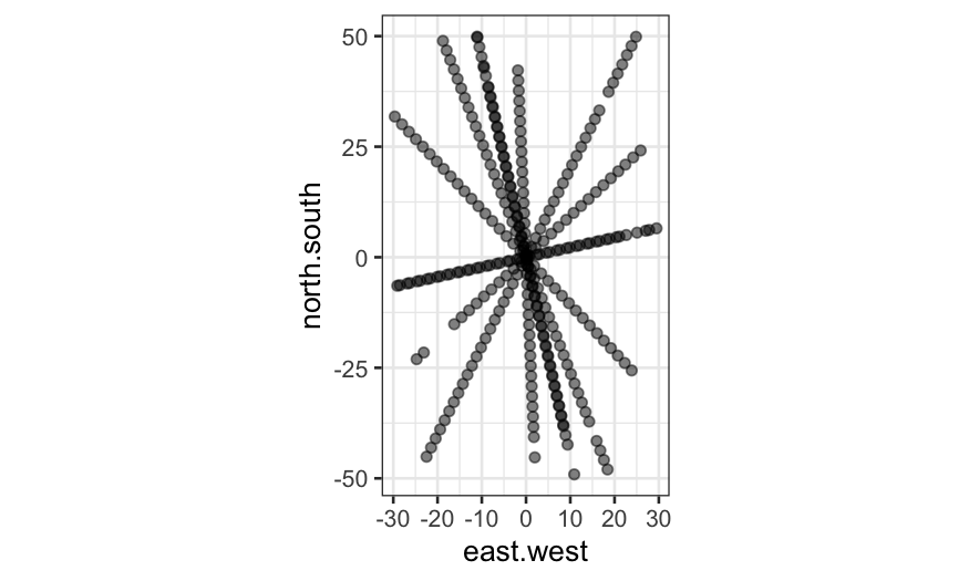
Let’s start out just plotting the explanatory variables to see where
we have measurements.
library(viridis)
load("../../datasets/lattice.RData")
summary(galaxy)
##    east.west          north.south          angle        radial.position
##  Min.   :-29.66693   Min.   :-49.108   Min.   : 12.50   Min.   :-52.4000
##  1st Qu.: -7.91688   1st Qu.:-13.554   1st Qu.: 63.50   1st Qu.:-21.3500
##  Median : -0.06493   Median :  0.671   Median : 92.50   Median : -0.8000
##  Mean   : -0.33237   Mean   :  1.521   Mean   : 80.89   Mean   : -0.8427
##  3rd Qu.:  6.95053   3rd Qu.: 18.014   3rd Qu.:102.50   3rd Qu.: 19.6500
##  Max.   : 29.48414   Max.   : 49.889   Max.   :133.00   Max.   : 55.7000
##     velocity
##  Min.   :1409
##  1st Qu.:1523
##  Median :1586
##  Mean   :1594
##  3rd Qu.:1669
##  Max.   :1775
ggplot(galaxy, aes(x = east.west, y = north.south)) + geom_point(alpha=.5) + coord_fixed()

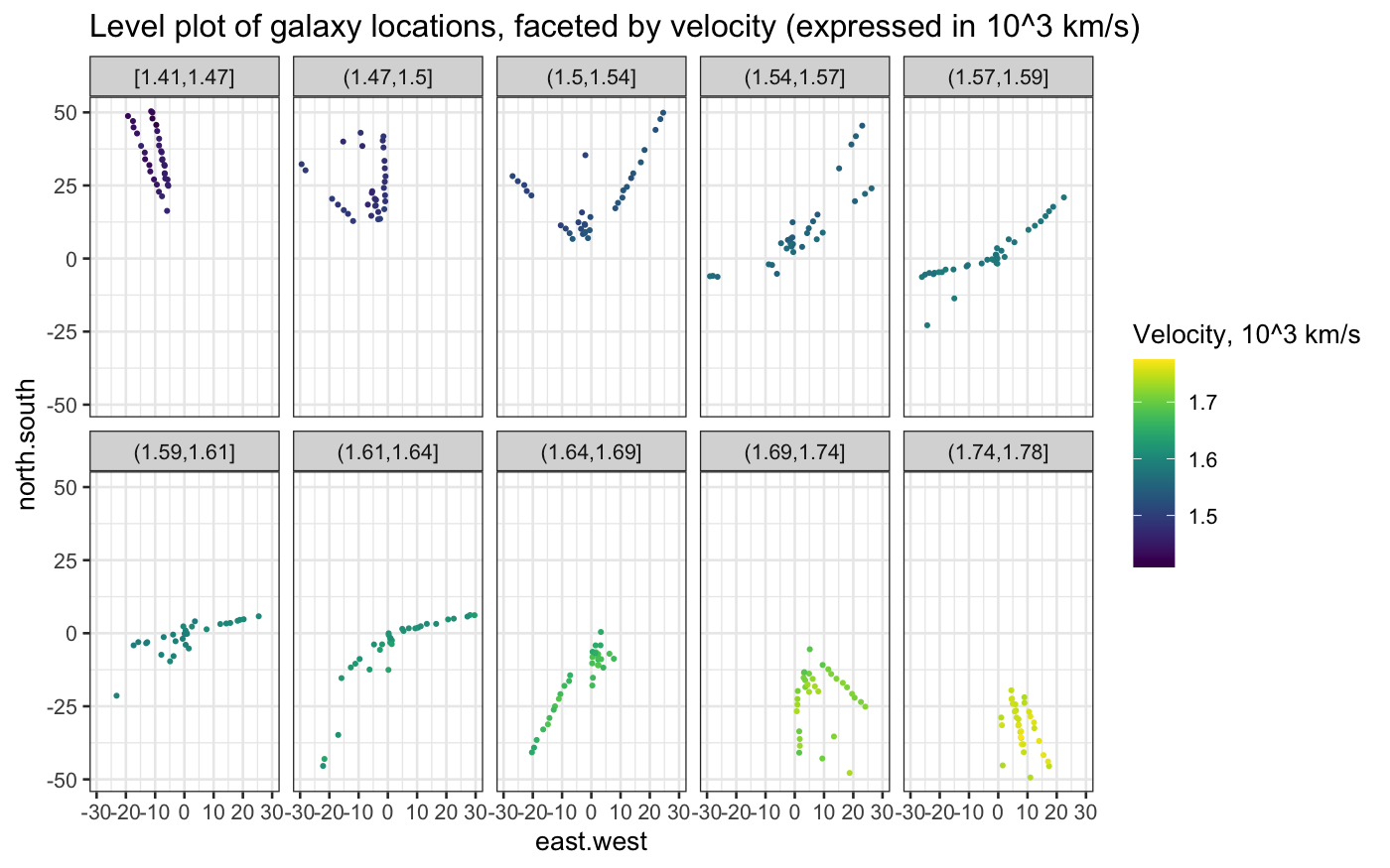
Next, let’s try a level plot of the data.
Remember that in a level plot, we plot the two explanatory variables
on the horizontal and vertical axes, and we facet on intervals of the
response variable.
## the cut_number command divides the range of a variable into
## intervals such that each interval has approximately the same
## number of observations
table(cut_number(galaxy$velocity, n = 10))
##
## [1.41e+03,1.47e+03]  (1.47e+03,1.5e+03]  (1.5e+03,1.54e+03] (1.54e+03,1.57e+03]
##                  33                  32                  33                  31
## (1.57e+03,1.59e+03] (1.59e+03,1.61e+03] (1.61e+03,1.64e+03] (1.64e+03,1.69e+03]
##                  35                  30                  32                  32
## (1.69e+03,1.74e+03] (1.74e+03,1.78e+03]
##                  33                  32
## we use cut_number to make the level plot/coplot:
ggplot(galaxy, aes(x = east.west, y = north.south, color = velocity * 10^(-3))) +
    geom_jitter(width = 0.5,  height = 0.5, size = .5) +
    facet_wrap(~ cut_number(velocity * 10^(-3), n = 10), ncol = 5) +
    coord_fixed() +
    scale_color_viridis("Velocity, 10^3 km/s") +
    labs(title = "Level plot of galaxy locations, faceted by velocity (expressed in 10^3 km/s)")

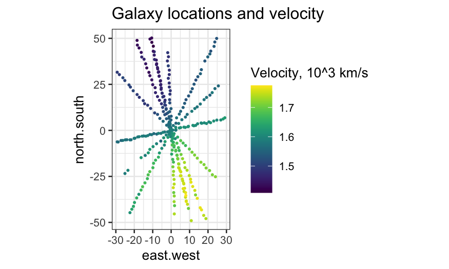
Compare the level plot with a plot in which velocity is indicated
solely by color:
ggplot(galaxy, aes(x = east.west, y = north.south, color = velocity * 10^(-3))) +
    geom_jitter(width = 0.5,  height = 0.5, size = .5) +
    coord_fixed() +
    scale_color_viridis("Velocity, 10^3 km/s") +
    labs(title = "Galaxy locations and velocity")

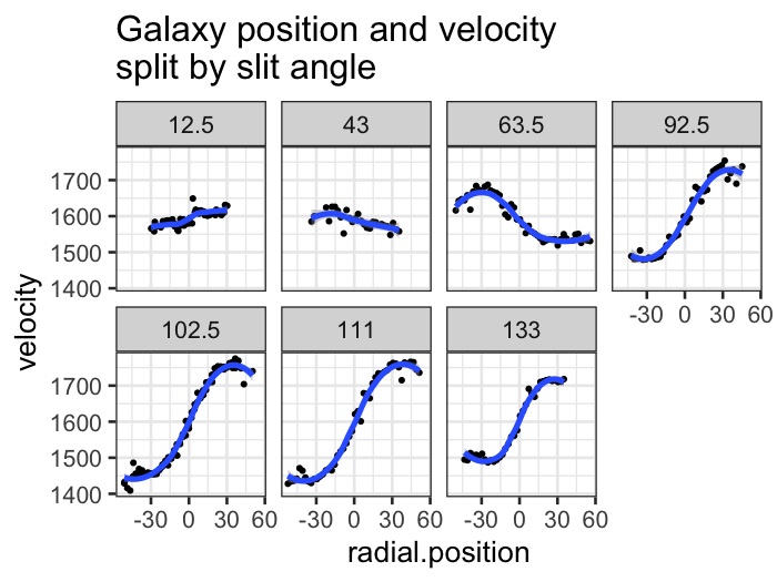
Once we have the angle and radial.position
variables, we can look at how velocity changes along each of the
trajectories.
ggplot(galaxy, aes(x = radial.position, y = velocity)) +
    geom_point(,size = .5) +
    stat_smooth(method = "loess") +
    facet_wrap(~ angle, ncol = 4) +
    labs(title = "Galaxy position and velocity\nsplit by slit angle")
## `geom_smooth()` using formula = 'y ~ x'

Since there’s nothing particularly special about the angles measured,
and we expect that velocity is smooth not just along those trajectories
but overall, we would prefer a 2d loess smooth.
galaxy_loess = loess(velocity ~ east.west * north.south,
    data = galaxy, span = 0.25,
    family = "symmetric", normalize = FALSE)
Why normalize = FALSE?
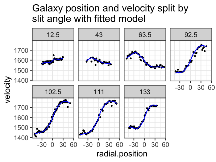
Making the analogous coplot with loess fitted values, we see a
similar but not identical smooth.
ggplot(augment(galaxy_loess, data = galaxy), aes(x = radial.position, y = velocity)) +
    geom_point(size = .5) +
    geom_line(aes(y = .fitted), color = "blue") +
    facet_wrap(~ angle, ncol = 4) +
    labs(title = "Galaxy position and velocity split by\nslit angle with fitted model")

Level plots for fitted values
To make a level plot, we first need to get fitted values for the
loess smoother at a grid of points:
galaxy_grid = data.frame(expand.grid(
    east.west = seq(-25, 25, 0.5),
    north.south = seq(-45, 45, 0.5)))
galaxy_smoothed = augment(galaxy_loess, newdata = galaxy_grid)
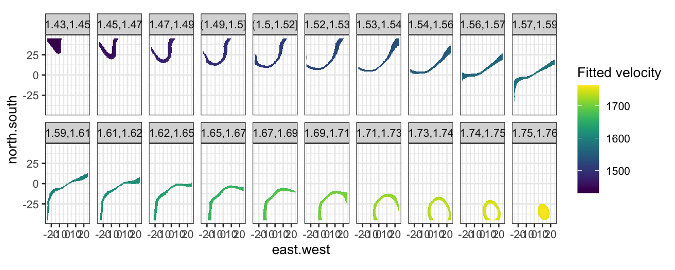
Then we can make the level plot by cutting the response into
bins:
ggplot(galaxy_smoothed, aes(x = east.west, y = north.south, fill = .fitted)) +
    geom_raster() +
    coord_fixed() +
    facet_wrap(~ cut_number(.fitted * 10^-3, n = 20), ncol = 10) +
    scale_fill_viridis("Fitted velocity")

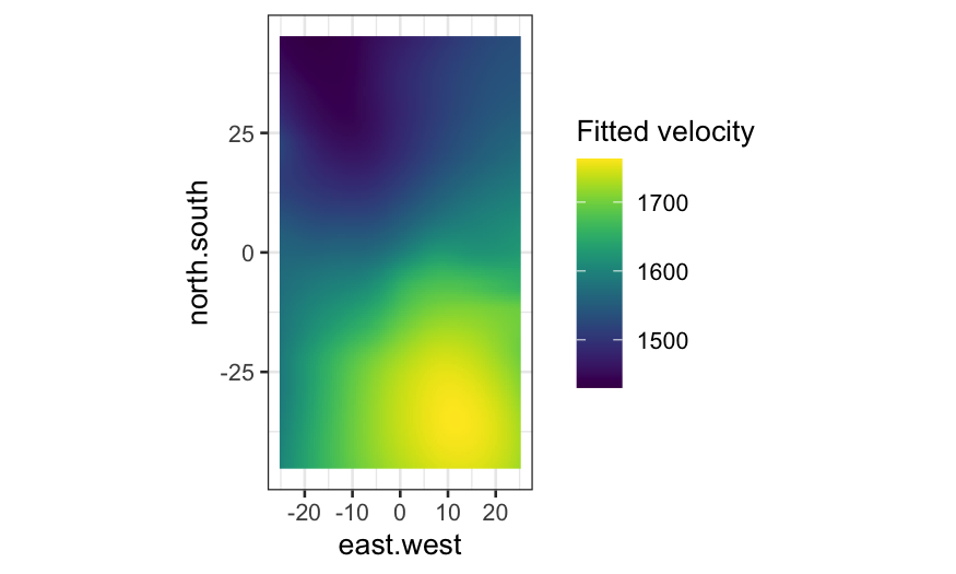
Again, compare the level plot with one where the fitted value is
indicated only by color:
ggplot(galaxy_smoothed, aes(x = east.west, y = north.south, fill = .fitted)) +
    geom_raster() +
    coord_fixed() +
    scale_fill_viridis("Fitted velocity")

Contour plots
Definition: The \(a\)
contour of a function \(f(x,y)\) is the set \(\{ (x, y) : f(x,y) = a \}\).
A contour plot of \(f(x,y)\) is a plot with \(x\) and \(y\) on the horizontal and vertical axes,
and one or more contours of the function \(f(x,y)\).
Note: Finding the contours is an inverse problem, and for most
functions we want contours of we won’t have anything available in closed
form. In practice, contours are computed numerically.
An algorithm for finding the \(a\)
contour of a function \(f\):
- Evaluate \(f\) at a rectangular
grid of points covering the region of study.
- Consider all the grid segments (line segments connecting two
neighboring grid points) for which one endpoint is at greater than or
equal to \(a\) and the other endpoint
is less than or equal to \(a\). Note
that if the function \(f\) is
continuous, the \(a\) contour must
cross the grid segment.
- Approximate the location where the \(a\) contour crosses the grid segment by
interpolation, and save the point.
- Draw contours by connecting the points (see pp. 242-244 for one way
to do this).
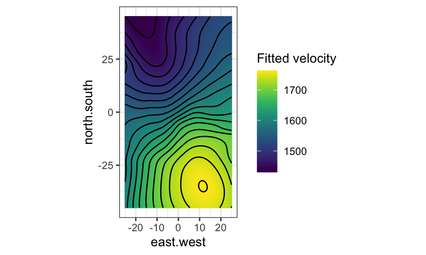
Contour plot interpretation
- Closely spaced contours indicate large slope.
- Parallel, evenly-spaced contours indicate the surface is a
plane.
Contour plots for galaxy data
ggplot(galaxy_smoothed, aes(x = east.west, y = north.south, fill = .fitted, z = .fitted)) +
    geom_raster() +
    geom_contour(bins = 20, color = "black") +
    coord_fixed() +
    scale_fill_viridis("Fitted velocity")

Again, compare with the plot with no contours and fitted value
indicated only by color:
ggplot(galaxy_smoothed, aes(x = east.west, y = north.south, fill = .fitted, z = .fitted)) +
    geom_raster() +
    coord_fixed() +
    scale_fill_viridis("Fitted velocity")

Soil data
The soil dataset contains measurements of soil
resistivity. The variables are:
northing: The position along one axis (not actually
north-south).
easting: The position along the perpendicular axis
(also not east-west).
resistivity: The soil resistivity.
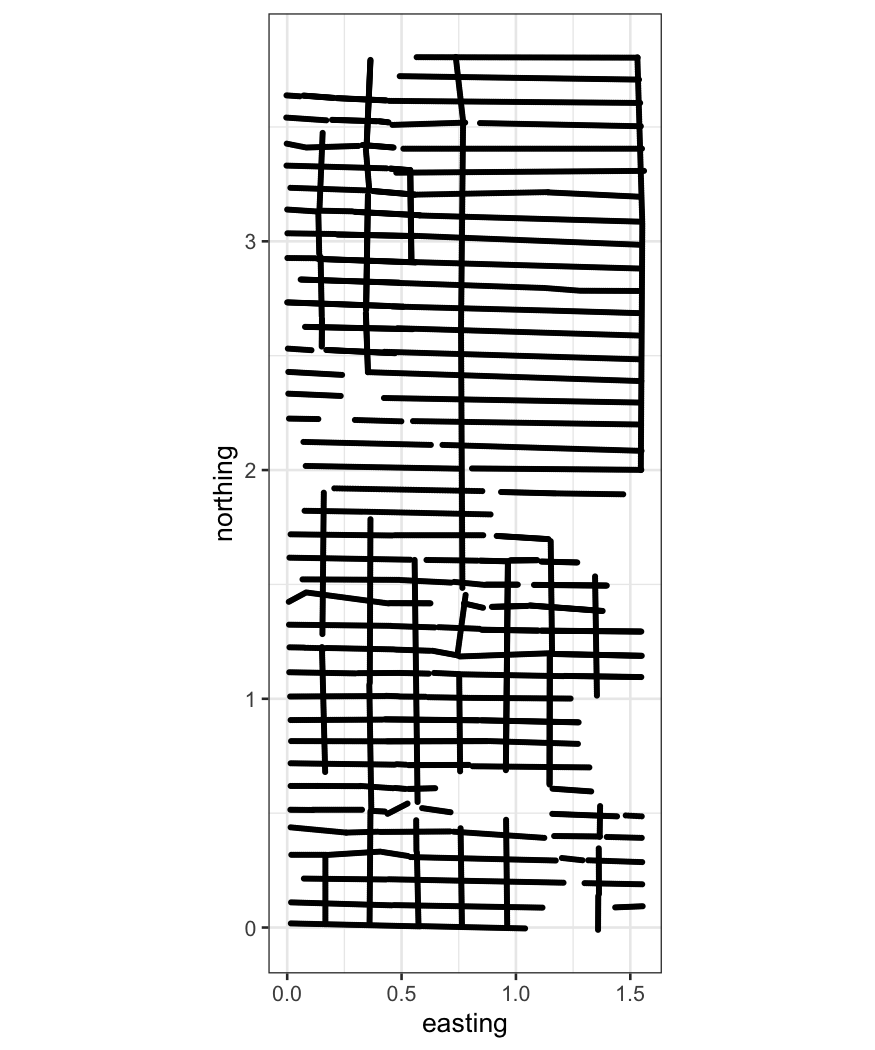
First let’s look at where we have measures of resistivity:
ggplot(soil, aes(x = easting, y = northing)) + geom_point(size=.5) + coord_fixed()

The plot above motivates the inclusion of the additional
variables:
is.ns: Was the measurement taken from a northing
track?
track: The ID of a track.
We can look at these two variables in a little more detail to see how
tracks are defined:
table(soil[,c("is.ns", "track")])
##        track
## is.ns     1   2   3   4   5   6   7   8   9  10  11  12  13  14  15  16  17  18
##   FALSE 113 142 157 166 156 128 107 166 184 230 139 190 166 226 193 202 134 128
##   TRUE  273 462 267 355 256 175 119 181   0   0   0   0   0   0   0   0   0   0
##        track
## is.ns    19  20  21  22  23  24  25  26  27  28  29  30  31  32  33  34  35  36
##   FALSE 125 109  93 187 110 134 148 153 188 203 219 202 214 201 199 179 182 177
##   TRUE    0   0   0   0   0   0   0   0   0   0   0   0   0   0   0   0   0   0
##        track
## is.ns    37  38  39  40
##   FALSE 180 203 118 102
##   TRUE    0   0   0   0
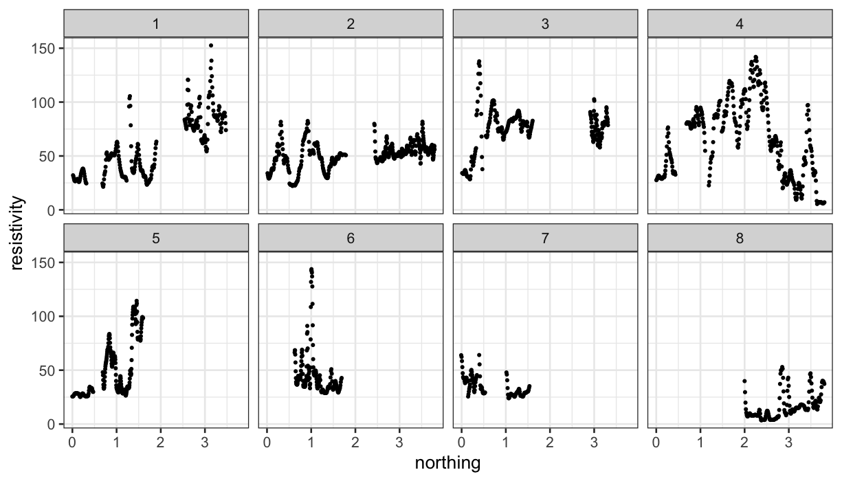
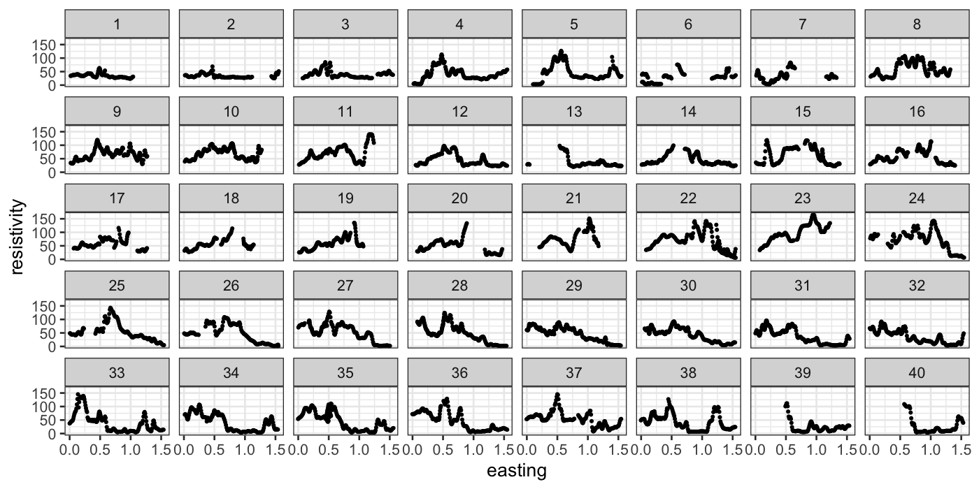
As with the galaxy data, we can look at resistivity along tracks:
ggplot(subset(soil, is.ns == TRUE), aes(x = northing, y = resistivity)) +
    geom_point(size=.5) +
    facet_wrap(~track, ncol = 4)

ggplot(subset(soil, is.ns == FALSE), aes(x = easting, y = resistivity)) +
    geom_point(size = 0.5) +
    facet_wrap(~track, ncol = 8)

Because the variables are interchangeable, we would prefer a 2d loess
fit:
soil_lo = loess(resistivity ~ easting * northing, span = 0.25, data = soil, normalize = FALSE)
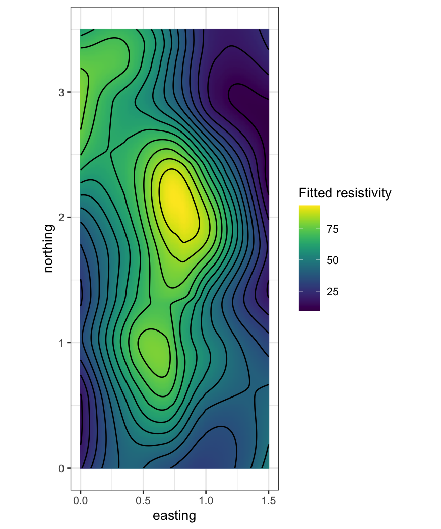
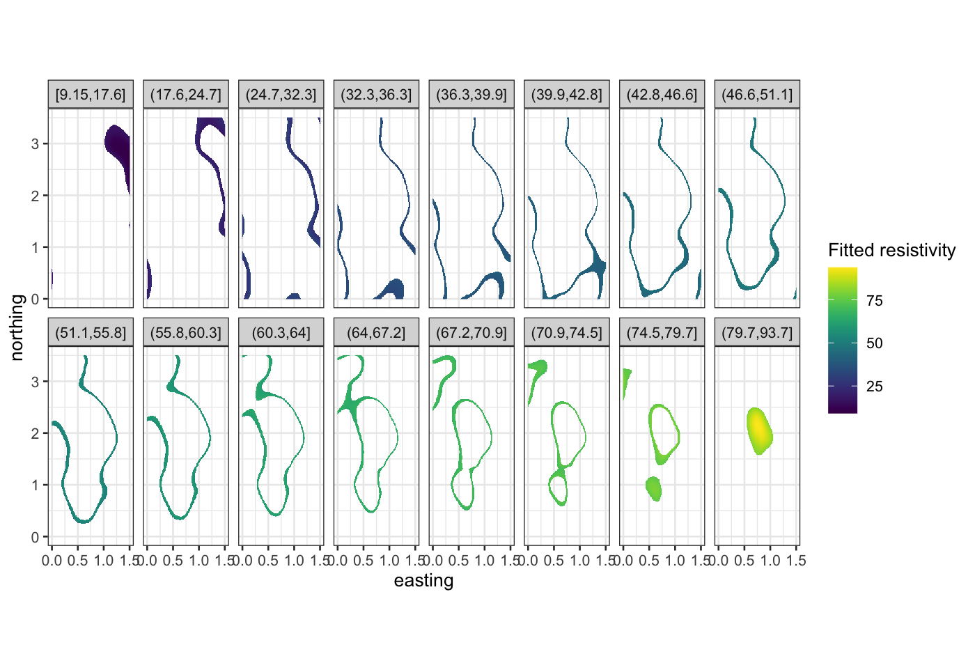
Once we have the fit, we evaluate it on a grid and make level plots
and contour plots:
soil_grid = data.frame(expand.grid(easting = seq(0, 1.5, 0.01),
    northing = seq(0, 3.5, 0.01)))
soil_smoothed = augment(soil_lo, newdata = soil_grid)
ggplot(soil_smoothed,
       aes(x = easting, y = northing, z = .fitted, fill = .fitted)) +
    geom_raster() +
    geom_contour(bins = 16, color = "black") +
    scale_fill_viridis("Fitted resistivity") +
    coord_fixed()

ggplot(soil_smoothed,
       aes(x = easting, y = northing, fill = .fitted)) +
    geom_raster() +
    facet_wrap(~ cut_number(.fitted, n = 16), ncol = 8) +
    scale_fill_viridis("Fitted resistivity") +
    coord_fixed()

Summing up: Trivariate data visualization
- Coplots for looking at conditional relationships. Used when the
conditional relationships are of interest, usually when the variables
measured are qualitatively different from each other.
- Level plots and contour plots (factor-plane methods). Used when the
conditional relationships aren’t as interesting (when any slice through
the plane of the two explanatory variables is as interesting as any
other).
